Wednesday, February 2, 2022

Ian Hamilton Finlay, A Rock Rose, with Richard Demarco, information sheet for The Wild Hawthorn Press, c. 1971


This is a simple information sheet publicizing Finlay's 'Wild Hawthorn Press' coupled with comments about the press from such worthies as Something Else Press and Art International.  But it's the image on the front (originally a print) that intrigues me, as once again Finlay's preoccupation with water, sea, and sailing comes to the fore, coupled with the 'rock' juxtaposed with the delicacy of the 'rose.' 

3 pages single-sided, each 4.74" x 7", and when fully opened 2' 7".


Tuesday, February 1, 2022

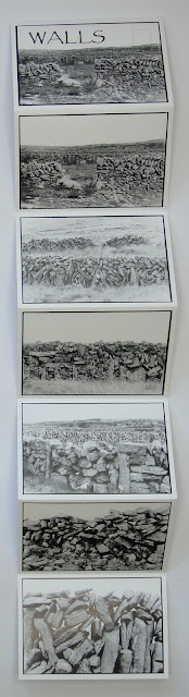
Carol Chase Bjerke, WALLS and TOUCH/STONES, offset printing, 2014.

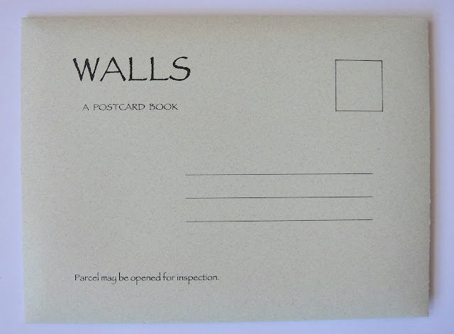
I was pleasantly surprised to find these two beautiful accordions by Carol Bjerke, a local book artist here in Madison. An added touch in their production is the nod to the photo travel souvenir accordion, with its folding cover and lines, readied for the address, and the stamp (as per the example I've included at the end).

I'll let the artist speak for herself about her intentions and spirit in which these two works were created:

"These books were done as part of the TOUCH/STONES series about some of the things people do with stones. A person picks up a stone and places it on a stone, and there is evidence of their having been at that place. All images were made on the Aran Islands, County Galway, Ireland. The accordion postcard format is patterned after a traditional photo travel souvenir - also evidence of a person having been at that place.

TOUCH/STONES


Cairns, Postcards, & Other Marks from the Journey

TOUCH/STONES is about the point of contact. A connection. A person picks up a stone and places it on another stone, and there is evidence of their having been at the spot. A cairn on a granite mountain. A wall on a limestone and shale island. A tomb, a portal, a stile. A ritual, an offering, a game, a path.

As I sat on a granite outcrop after hiking to the top of one of my favorite mountains in New Hampshire, my gaze moved from a breathtaking 360-degree panorama to focus on the stone trail markers nearby. Marks left by those who went before to indicate the path for those who would come after. These cairns have been part of my life since childhood, images engraved in my mind together with protocol for safety and etiquette along the hiking trail. On this particular day with my camera hanging from its strap around my neck, I thought to capture the cairns on film. But as I studied the magnificent structures, assembled and reassembled over time, they seemed to call for a more meditative approach. I reached in my pack and found a pen. The only papers were some artist postcards, souvenirs from my last museum visit. So be it. Intent on pursuing my current motive, I spent the next hour or so making contour drawings of several of the stone formations, ignoring the postcard imprints already occupying the paper surface. Only later did I acknowledge the fortuitous relationship between the lines of my drawings and the lines and text of the postcard layout. Later still did I realize its formal and conceptual potential for the TOUCH/STONES project. A person sends a postcard from a place, and there is evidence that the person was there. The journey extends to far-reaching experiences, and then returns to the studio.

A lesson learned from ancient stones in Ireland has to do with how little contact there needs to be between one heavy piece and another if they are well-placed. In other words, there is a lightness at the point of contact that defies the heaviness of the materials."

Carol Chase Bjerke


the work's envelope


reverse side with address/stamp locations

Both accordions: 
8 double-sided pages, individual page 5" x 7", and when fully opened 3' 4" x 7".


the work's envelope


reverse side with address/stamp locations

Santa Catalina, California, souvenir accordion with folding flap for mailing, 1939


Thursday, January 13, 2022

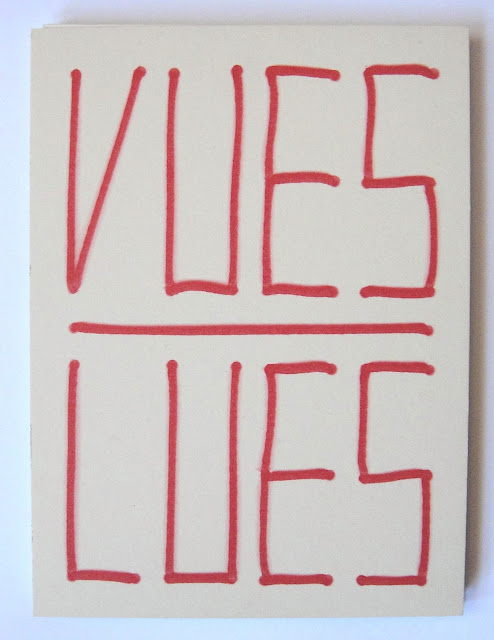
Marion Bataille, Vues/Lues [Seen/Read], Zeug, France, 2018, ed. 1000


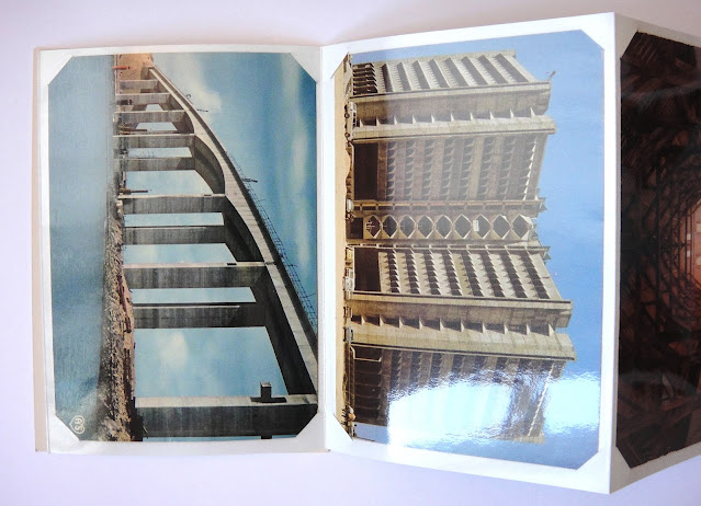
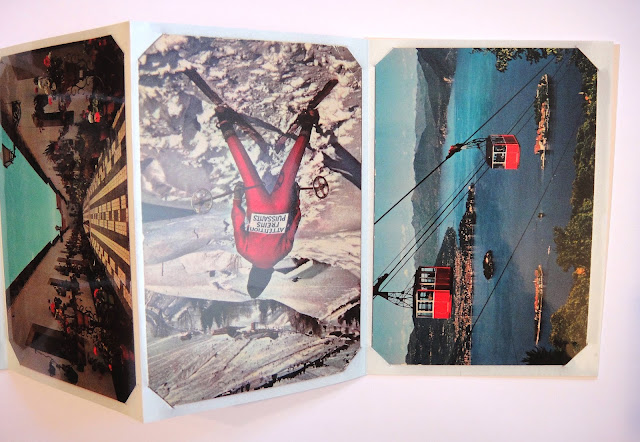
When I first got this accordion and took a look at it, I thought "what the hell," thinking that it was just a bunch of tourist postcards in a faux album, and in a variety of confusing orientations — I couldn't make any sense of it at all! So I did a little research and discovered two really cool other books that Bataille had published (both below). The first one titled ABCD (2008) was a clever alphabet book that when the reader opened a page it activated a folded letter to pop-up fully formed between the pages. The second book 10 (2011), also required the action of the reader, but this time when the pages were opened the folds revealed not only a number on the front, but a descending number on the back from 10-1, very smart stuff!

So, it became clear to me that Bataille was playing with pages in a rather unique and technically sophisticated manner. And then somewhere I read that Vues/Lues was also an alphabet book. It was only then that I both saw and read what she was doing with this accordion. It's an accordion in which she has sequenced these touristy postcards using the predominant shapes in each card to create the letters of the alphabet! This book though, was much simpler technically than the others, and is really a conceptual book. However, it also fits neatly within the arc of Bataille's exploration of the nature and form of the book, and especially the page itself.

12 double-sided pages, each 6" x 4", and when fully opened 4' 4".


A, B

C, D

G, H, I

reverse side

M, N, O

Q, R
 X, Y, Z

back cover

____________________________________________________________________

Marion Bataille, ABCD, Roaring Brook Press, New York, 2008


_____________________________________________________________________________________

Marion Bataille, 10, Roaring Brook Press, New York, 2011


Wednesday, January 12, 2022

Carles Garcia O'Dowd aka G.O'D., Closer to Heaven: A visual opera, Stranedizioni, Italy, 2018, ed. 350

front cover

This accordion is a really wild ride! Taking the popular Mallorcan resort town of Magaluf as his subject, O'Dowd, a native Mallorcan himself, packs it with real and imagined scenarios of people having a seriously good time. All sorts of activities are taking place simultaneously, which this accordion both celebrates, and critiques at the same time. O'Dowd in his artist's statement reflects on this state of affairs and the effects of the global tourist industry when he writes, "In the long run, it's establishing itself as a contemporary form of colonialism; and places like Magaluf can be found everywhere around the globe. This drawing reflects on the reality that such economical models shape, using cartoon imagery from Carles G.O.D.'s fictional cosmogony: The Rise and Fall of Eden." But, in the meantime, everyone parties on!

7 double-sided pages, each 6.5" x 11.25", and when fully open 3' 9.5".


front and back covers

inside the cover with the artist's statement in four different languages

the artist's statement

front


back


back cover

Tuesday, December 28, 2021

Tydningen, #36, 2020, Sweden


A special accordion issue of this Swedish Journal of Poetry, Criticism and Theory edited by Erik Sandberg and Filip Lindberg, with featured contributors Cheena Marie Lo, Imri Sandström and Jennifer Hayashida.

On their website Tydningen is described as "...a literary journal for poetry, theory, art and critique, with a special interest in creating spaces for critical, exploratory, experimental and experimental practices within the framework of the journal format."  I say, way to go with breaking out into the accordion format and creating a new kind of space, and pages for their inquiries!!


6 pages double-sided, each 8.25" x 5.75", and when fully open 2ft 9.5".


back cover


Levi Sherman, Various Effects of Coffee on the Body, and Rich, Deep, Bittersweet, Center for Book and Paper Arts, Columbia College, Chicago, 2013.

Various Effects of Coffee on the Body, 2013


Two funky little accordions that take coffee as their subject matter and both come from Sherman's research into coffee, indeed in 2013 he traveled to Colombia "...to examine the relationship between Latin American coffee farmers and coffee consumers through photography, interviews and research." The images in both accordions of coffee laborers, were found in Chicago area coffee houses and tasting notes from coffeereview.com.

For a 2014 interview with Sherman about his work see: Featured Artist: Levi Sherman – The Columbia Chronicle

Both accordions: 8 double-sided pages, each 2"x2", and when fully opened 1ft 4".


Rich, Deep, Bittersweet, 2013