Thursday, December 23, 2021

Barbara Balfour, Ex Libris, 2008


This rather intriguing accordion arises from Balfour's practice of exploring the relationship between the textual and the visual. I'll leave it to this Professor of Print Media in the Department of Visual and Art History at York University, Toronto, Canada, to explain what she is attempting to do in this accordion. 

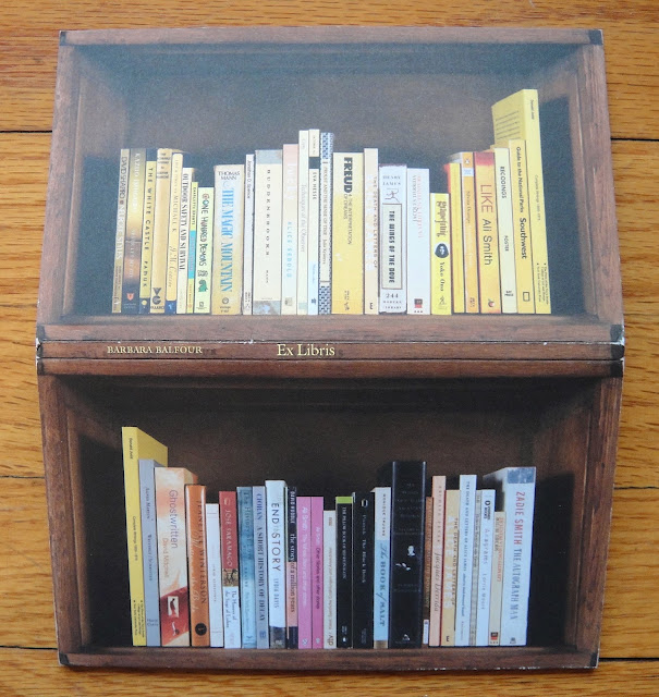
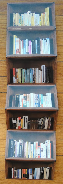
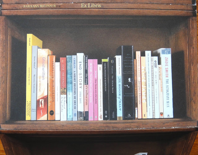
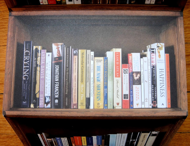
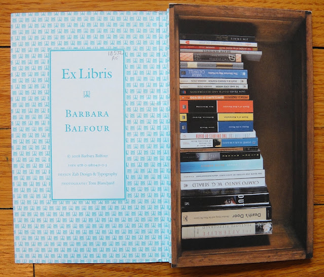
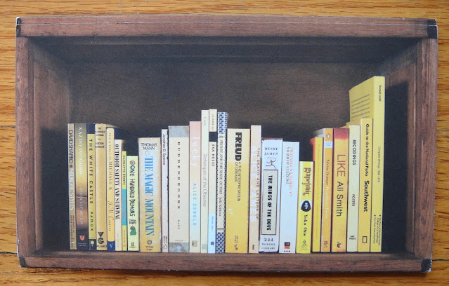
"Ex Libris is both an accordion-style multiple and a series of seven digital prints. Initially bemused by interior decorators who reassemble clients' libraries into 'mountain' and 'valley' configurations, I set out to create meaningful and no less attractive concatenations of books. Acknowledging books as objects of beauty as well as substance, possessions people often refuse to get rid of even though they will never again be read, I reflect on what they might mean to their owner.

Drawing from my own idiosyncratic approach to shelving, I grouped and ordered my books in certain arrangements staged for this project. The titles visible on the books' spines act as as curious placeholders that are enigmatic or evocative, depending upon one's knowledge of the books in question. Beginning with the Yellow Shelf and culminating in Death Shelf, the work ends on a hopeful note with mention of the arfterlife. Overall, Ex Libris is an admittedly slow read.

Titles of Individual Shelves: Yellow, Writing, Characters, Doubles, Place and Time, Emotional Range, Death Shelf.

This book is a project inspired by Norman Bethune's personalized bookplate, which reads: "This Book Belongs to Norman Bethune and Friends." Bethune, the Canadian doctor eulogized by Mao Zedong, turned the proprietary notion of the bookplate upside down by this simple gesture. With a collectivist spirit, these bookplates read "This Book belongs to ______ and Friends."   [http://www.barbarabalfour.ca/ex-libris1.html]

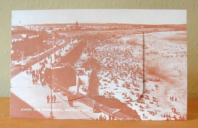
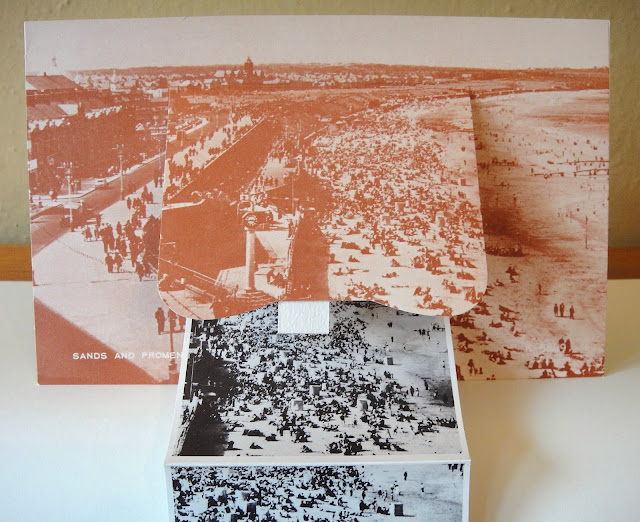
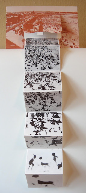
7 single-sided pages, each 4" x 7" and when fully opened 4' 1".


Stephen Perkins, Pop House, 1988/1997, ed. 2.


A fun little accordion that I did some years ago that takes Richard Hamilton's famous 1956 collage "Just What Is It That Makes Today's Homes So Different, So Appealing?" as its centerpiece, and I coupled it with a photo of some bemused Soviet soldiers looking into this 'pop house', accompanied by a British Royal Air Force jet.

3 single-sided pages each 4.25" x 4", and when opened up 11.25". 


back cover


Richard Hamilton, Mother, photolithograph, Letter Edged in Black Press, New York, 1968


I was really pleased to find a copy of this work by the late great British artist, Richard Hamilton (1922-2011) that was included in the first issue of SMS (Shit Must Stop) a portfolio/magazine published in a series of six issues in 1968 by William Copley and Dimtri Petrov. Here, Hamilton plays with the idea of sending a holiday postcard back home to 'mother,' but with an accordion inserted inside of it that gradually zooms into the blurry silhouettes of two children playing on the beach. On the lower left corner of the card is the title "Sands and Promenade, Whitley Bay," this is a famous seaside resort located on the north east coast of England, and in the county of Northumberland.

Across these 6 wonderful SMS portfolios the editors published original multiples of works selected by each of the 73 artists in the series, and in editions of 2000 copies each. 

Note: in most of the materials related to this work the title is always listed as "A Postal Card for Mother," and yet the title on the back of the card is "Mother." Unless, I find out otherwise this is the title I'm sticking to for the moment!

Card dimensions: 5" x 8", the accordion's eight single-sided pages measure 3.5" x 2.5" individually, and when it's fully opened the work measures 20" in length.


back of card