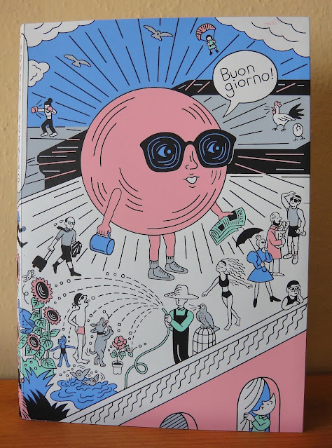
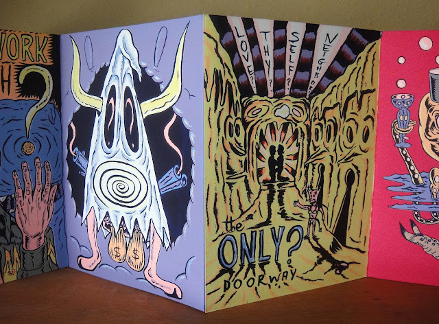
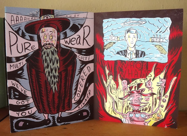
The Leporello Series is a new series of accordion artists' accordion books, published by LL'Editions. Inhabiting a space between book and paper sculpture, the leporellos are printed on delicate Mohawk Eggshell paper. Each volume in the series is limited to 250 numbered copies and come in a bespoke rigid box, with the title hot foiled both on its front and on its spine, allowing it to sit comfortably in a bookshelf when not on display.
For The Leporello Series, ll'Editions has invited a select group of international artists to contribute. Each artist is given carte blanche, restricted only by the accordion format and its ten panels (recto). [LL'Editions statement]
Leporello #1, Heimo Zobernig, 2021
10 single-sided pages, individual pages 5.5" x 4", when opened 3' 4"
As with all the leporellos from the LL'Editions series the presentation is really excellent. The care taken in the creation of this 'bespoke' box, and its role as a holder and protector of the work is first class, and it feels nice to hold!
Heimo Zobernig (b. 1958) is an Austrian artist who is a Professor of Sculpture at the Academy of Fine Arts in Vienna. Working across a range of media, books and printed matter have constituted a large part of his oeuvre since 1980. As can be seen with this work his material is language itself, and this piece explores this through the visual and verbal play between a minimum of words.
through a smartly designed interior.
front cover
back cover
Leporello #2, Micah Lexier, 2021
10 double-sided pages, individual pages 5.5" x 4", when opened 3' 4"
Micah Lexier is a Canadian artist currently living in New York. I'm going to excerpt below the excellent introduction to this work from the ll'Editions website:
"A number of years ago Micah Lexier purchased a small paperback publication about the game of dominoes. The very end of the book consisted of a series of pages that reproduced a complete set of twenty-eight domino tiles. The images were printed on right-hand pages, four to a page, while the left-hand pages were blank. The idea was that you were supposed to cut these images out of the book and glue them to empty matchboxes to create your own do-it-yourself set. That sequence of pages, combined with the quality of their reproductions, was the inspiration for Lexier's leporello. To that, he added two favourite print techniques - perforations and die-cut holes - to create a set of ten domino tiles. Lexier chose the denomination of each tile and its order in the leporello so that none of the thirty-four die-cut holes line up with each other, allowing each hole to be misread as a printed white domino dot."
front cover
reverse side
back cover
Leporello #3, Fiona Banner, 2021
10 single-sided pages, individual pages 5.5" x 4", when opened 3' 4"
In 2009 Fiona Banner completed a work titled "Portrait of an Alphabet," in which she photographed herself in a photo booth holding up large sheets of paper, each with individual letters of the alphabet. This work is a reworking of that work, and every now and then you can see a hand holding the edge of the sheet and the spell is broken. ll'Editions suggests "the work can be seen as a form of self-portrait. A portrait of the artist as a typeface."
front cover
Leporello #4, Ryan Gander, 2021
10 single-sided pages, with magnifying sheet, individual pages 5.5" x 4", when opened 3' 4"
Once you start 'reading' this text it quickly becomes clear that its a non-narrative text that represents selections from Granger's work Staccato Refractions (2020). The publishers' website states, "Presented as concrete poetry, the prose reveals intentional glitches, making the reader question the nature of the narrative. Man or machine? Is the text, or parts of it, a message transmitted by a computer, or perhaps an example of distributed thinking?
The text is rendered in minuscule typography, transforming it to shape and form. For its transcription, the use of an included magnifying sheet is necessary. In the background, a pale sequence detailing the moon's movement is rendered. Once the lights are dimmed, the moon starts to glow, moving from subordinate to superior." [https://lleditions.se/product/leporello-no-04-ryan-gander/]


