Pushing the Fold:
Graphzines from Le Dernier Cri
Introduction
In 1993, the Parisian artists Pakito Bolino and Caroline Sury created a freewheeling and experimental publishing enterprise called Le Dernier Cri (The Last Cry). Since then they’ve been publishing wildly colorful and experimental screen printed graphzines as well as copious numbers of screen print posters, alongside music CDs and DVD animations, and tarot card decks.
The phrase, Le Dernier Cri (LDC), translated into English has two definitions, one is ‘the last cry’ which suggests a desperate human response to an untenable situation, and the other definition lies in its everyday idiomatic use in which it means ‘the latest fashion.’ Both in their different ways express a sense of being at the edge of something both desperate and of the moment.
It was their graphzines that initially drew my attention to LDC as they published them not only in the traditional book format, but also as leporellos and many others in experimental folded formats. These publications clearly illustrate the couple’s delight in deconstructing traditional book formats and creating new, playful and unconventional structures through a combination of gatefolds and ever-expanding page flaps that engage the reader in new and unexpected ways.
Early Years
Both artists have art school backgrounds with Bolino having studied at the l’Ecole des Beaux Arts in Angoulême and Sury at the l’Ecole des Beaux-Arts in Bordeaux, both schools based in the Western part of France. Bolino had also gained screen printing experience when he worked in a studio run by l’APAAR (Association Pour Adultes Avec Réserves/Association for Adults with Reservations) which also exposed him to the work of contemporary American cartoonists and illustrators.
Both artists had experience publishing their own books and magazines. Sury was involved with a group of artists in publishing the zine Hello Happy Taxpayers, while also creating her own silkscreen works.1 Meanwhile, Bolino had “…started doing photostat books by myself in very limited editions, eventually realizing that what I was doing was rather pointless, because nobody gave a shit about such cheap, homemade zines.”2
Experimental music was also a key part of both artists’ creative lives with Bolino playing first, in the band La Mâchoire (The Jaw) and then Les Plaies Mobiles (Mobile Sores), while Sury was the singer in a band with her then boyfriend called RWA. She met Bolino through common friends and the couple were initially based in Paris.
It was this musical connection and sheer happenstance that would lead to the creation of LDC, and as Bolino tells the story he was at their music studio one day and “…noticed a seemingly unused silkscreening studio in one of the buildings.” After finding the manager he signed a contract with him and “At last I was able to create my own editions: Le Dernier Cri was born.”3
Their first collaborative project was “…a silkscreened graphic bulletin under the name Le Dernier Cri.”4 Published in ten issues between 1993-1995 it consisted of a folio of loose silkscreened prints created by a variety of Paris-based artists and it embraced a number of varying styles including Art Brut, Visionary, Abstract, Psychedelic, Neo-Expressionism and Manga.
Meanwhile relations with the manager of the building, coupled with roommate issues in their Paris apartment necessitated exploring new living and work environments. On a visit to Marseille for an exhibition they discovered an old tobacco factory that the city was turning into artists’ studios, rehearsal spaces and artists’ residences known as La Friche (The Wasteland). They put in an application for a studio and once it was accepted they moved to Marseilles and started putting together their screen printing studio. The year was 1995, and they have been there ever since.

One of the first projects they started after the move to Marseille was the graphzine Hôpital Brut (Raw Hospital). This substantial anthology of works by artists, musicians and illustrators all of whom were asked to “…write articles on subjects of their choice and mix it up with a whole bunch of pictures,” was published in an edition of 1000 and sold out within six months.5 With the publication of Hôpital Brut, Bolino and Sury firmly established the aesthetic territory that LDC has continued to mine into the present.
Graphzines
Graphzines have their roots in both the American underground comics scene and homegrown publications found in France. When both are combined with the post-May 1968 period in France and later the post-punk era of the early 1980s, you have a recipe for a very different kind of publication.
The term “graphzine” originally appeared in a text by André Igwal in the first issue of the French comics magazine Zoulou (#1, 1984), in which he highlights how graphzines differed from the contemporary fanzines of the period writing, “…graphzines were beautiful and polished. No more boring activist fanzines printed on a rotten mimeograph machine. No more good words. Make way for expression, long live dirty images.”6 As their name suggests, graphzines combine graphic imagery with the spirit of independence so central to the zine community.
While fanzines are typically a means through which the editors express their passion for a particular band or type of music amongst a myriad of other themes, graphzines encompass a much more defined territory as expressive vehicles for the editor’s own personal quirks and obsessions. The ‘graphic’ element of graphzines, or their pronounced visuality, is one of the overriding features of this genre. Many also include texts which reflect the influence of traditional comics, and the following quote from a commentator explores the experimental interplay between images and words that can be found in graphzines, noting that some:
…include a lot of writing, even if it’s not conventional narrative text. Some are filled with short texts, fragments, collages or words, or typographic compositions, or contain dialogues, poems, slogans, or even prose. Others mix texts and images in such a way that it’s impossible to separate one from the other. The boundary is not fixed. Rather than a single form, the graphzine is a space of experimentation.7
When these image and text combinations are paired with the graphzine’s plethora of artistic styles and frequently edgy subject matter, you have a new kind of publication that is a potent cocktail that “…acts as a space of rupture, or refusal—refusal of formatting, refusal of normativity, refusal of readability, sometimes even of taste and morality.”8 Furthermore, the power of the graphzine also resides in its physicality and as one writer aptly describes it;
A graphzine must be looked at, flipped through, touched. Its graphic dimension is not limited to the images it carries; it resides in its formats, its bindings, its textures, its ink and paper choices, the way it ages, its smells even. It is a total graphic object, irreducible to the printed image (my emphasis).9
Between 1993-2020 LDC published over 400 books in editions of 100-1000 copies, with most of them printed in the low 200-300s.10 During this same time period they published over 200 screen print posters along with 5 animated films and over a dozen tarot card decks.
Raw Art and Art Brut
LDC’s house publication Hôpital Brut (Raw Hospital), quivers with the overwhelming influence of the Art Brut (Raw Art) movement and eloquently displays the work of many of the self-taught and outsider artists who comprise a considerable portion of the publication’s national and international contributors. A quick look at a sample of their publications provides powerful evidence of the influence of this movement, that was both identified and named by the French artist Jean Dubuffet (1901-1985). Dubuffet was the first to collect the works of self-taught artists, who had been ignored by the art establishment because they fell outside the academic canon of the time.11
“Raw” is the operative word when describing the range of subject matter depicted in LDC’s publications. As their statement of intent on their website makes clear, they want no one to remain impassive when encountering their productions, writing;
The reader, spectator, listener is grabbed, struck, seized, confused, he finds himself brutally deprived of his retreat as a dissatisfied consumer. Eye rehabilitation has only just begun!12
Furthermore:
The hyper density of this production makes Le Dernier Cri impossible to label, while creating a siphon that sucks in the most unclassifiable international artists. Heterogeneous in their styles, in their thoughts, these marginal, unmanageable and irrecoverable artists are the heart of Le Dernier Cri.13
Printed Matters: Three Collections
Surveying the range of screen printed publications published by LDC it becomes clear that their graphzines fall within two distinct formal groups; those that utilize the traditional book format and those that employ the fold in creating their leporellos and folded books.14 It is to this latter group that I want to turn my attention, as I find them to be the most interesting and challenging, both formally and conceptually.
The Sandwich Collection
The first group of publications I want to examine is a discrete series of leporellos known as the Sandwich Collection. Published in twelve issues between 1996-1999, they are square in format and are comprised of seven double-sided pages “sandwiched” between stiff covers. These eight page double-sided leporellos are modest in size compared to the extravagance of many other LDC publications. The series begins with Caroline Sury’s sexually explicit work, Sex Tonic Avec Animaux (Sex Tonic With Animals, 1996), which features a series of drawings depicting a naked female figure engaged in assorted sex acts with her male partner, accompanied by the active participation of a variety of animals.


The reverse side reveals a long panoramic drawing in which the same female figure takes up various provocative positions atop a serpent whose body fills up the whole length of the leporello.15 This is the only work by a woman artist in the series and it’s by far the most sexually explicit of the group. Printed in bright pink on the front side which matches its sexy theme and the reserve side is a combination of green and orange, which creates an interesting tension between the active female figure and the recumbent snake.
Other leporellos in this series feature portraits sequenced across this elongated format. Leo Quievreux’s Straw on the Blue Line (1997) most closely resembles a traditional comic with texts accompanying the hand drawn story about a gangland betrayal and its consequences. Quievreux takes full advantage of the panoramic features of the leporello with both sides containing one single drawing, and both with texts interspersed irregularly along their length, and in the process he disrupts the traditional relationship between a comic’s images and its accompanying texts.
Published at the beginning of LDC’s publishing history the twelve leporellos in the Sandwich Collection tentatively explore themes and formal concerns that would later be expanded upon and pushed to the extremes in their publications in the coming years.
Leporellos
In a substantial exhibition catalogue for a 2020 retrospective of LDC’s publications titled Mondo Dernier Cri: Une Internationale Sérigrafike (Mondo Dernier Cri: An International Screenprint) at the International Museum of Modest Arts in Sète, Southern France, there is a checklist titled “Catalogue des éditions: Le Dernier Cri 1993-2020.” This list contains 416 entries for books, leporellos and prints produced throughout this twenty-seven year period, and aside from the twelve leporellos in the Sandwich Series, the list includes a total of eleven leporellos published between 1996-2020.16
One of LDC’s early leporellos is Jonathon Rosen’s The Birth of Machine Consciousness (2003). This publication is quite distinct from all their other leporellos by virtue of its large square pages (11.25”/28.5cm) and its thirty single-sided pages which create an impressive publication that is over twenty-eight feet in length. This leporello is a graphic meditation on our relationship to machines accompanied by illustrations that were “…conceived and executed using mechanical extrapolations of the body as a device for exploring the full spectrum of human emotional states states.”17 Like many other of LDC’s publications this leporello creates an alternative visual and psychological universe in which Rosen depicts “…a radical breach in the threshold between meat on one side, and electronics, prosthetics and robotics on the other.”18


Three other leporellos, Gwen Tomahawk’s, Toxique (Toxic, 2010), Remi’s, L’art de La Guerre (The Art of War, 2011) and Eléonore and Kenny’s, Les infants vaudous (The voodoo children, 2024) are formally quite different from Rosen’s book in that they all use the space of the leporello to create one long continuous panoramic image. Tomahawk’s scratchboard leporello depicts a dark and ravaged toxic environment with a final ominous image depicting a mass of desperate people gathered atop steep cliffs with the sea far below.

 Gwen Tomahawk, Toxique, 2010
Remi’s L’art de La Guerre, another scratchboard work, also employs the panoramic qualities of the leporello to create one long single image. One side of this work depicts a dark world set within a wartime environment in which civilians are being massacred by machine gun toting soldiers. By contrast, the image on the reverse depicts a line of soldiers with their guns and exposed penises encountering an enraged woman who, in an act of resistance, raises her dress and pees at the soldiers. Finally, Eléonore and Kenny’s Les infants vaudous is an eye-popping two-sided panoramic leporello printed in vivid fluorescent colors, that depicts a world of densely illustrated characters cavorting in a circus-like environment. One side of this leporello is titled “Dressed World” and the reverse side “Naked World” with both sides depicting the same image, but in the different stages of being dressed and undressed. This is a memorable leporello that upon closer inspection slowly reveals its secrets, with all sorts of deviant activities taking place in the cracks and crevices of these two panoramic drawings.


Multiple Leporellos
One of the many innovations LDC has introduced into the world of graphzines is creating publications that contain more than one leporello nestled within a one-piece folded cover. The following three publications all illustrate this innovation, Tetsunori Tawaraya’s Too nice junk, (2019, 3 leporellos), Andy Bolus, Zven Balslev and Pakito Bolino’s, Crypt of Sados (2019, 6 leporellos), and Gwénaelle Lacoste’s, Les Superheros de L’Arche (The Superheroes of the Ark, 2022, 3 leporellos).


Tetsunori Tawaraya’s, Too nice junk, with its three leporellos illustrates how more than one can enhance the message of the work. The three double-sided leporellos serve to reinforce the theme of the work in its depiction of a strange world populated by semi-human people and creatures. Each leporello supports this imaginary world by depicting these beings in various poses and activities, with all of them melded together by the wildly saturated and iridescent colors used in their production. The four-page cover is an extra delight as it beautifully suggests the wonderful and strange world depicted inside.


The final publication I want to examine is Andy Bolus, Zven Balslev and Pakito Bolino’s Crypt of Sados that comes with six double-sided leporellos nestled within its cover. This publication I consider to be the coup de grâce of LDC’s leporello publications as I have not seen anything like this kind of presentation before. The titillating title gives away the underlying theme of this work, accompanied with a small “Adults Only” warning on one of the leporellos. While the title suggests that sadomasochism and its quest for sexual gratification through the infliction of pain and humiliation would be the main subject matter of the work, in reality only a small number of images deal explicitly with sexual activity. The majority of the images address a range of subjects that are close to the heart of each artist. While it’s unclear to me who created each leporello and how much collaboration took place between the artists, the overwhelming feeling upon viewing this work is one of frenzied activity and a powerful blending of each artists’ visual styles. One additional feature of this publication is that when it’s opened up and all six leporellos are displayed together on a flat surface, they create a visually engaging installation, and mini-exhibition of the works.


Gatefolds, Page Flaps and Expanded Books
LDC’s playful experimentation with the structure of their books includes incorporating multiple extended page flaps, four-page wide center gatefolds, and off-center stapled bindings, which combined with the idiosyncratic sequencing of these formal elements, results in wonderfully interactive and expanded bookworks.
The inclusion of multiple extended page flaps of one or more pages, four-page wide centerfold gatefolds, and off-center stapled bindings, which combined with their idiosyncratic sequencing of these formal elements, results in wonderfully interactive and expanded bookworks.


Two publications that illustrate the power and visual impact of LDC’s use of four-page centerfold gatefolds are Progeas Didier’s, Mira Foutrak (2012) and Martin Lopez Lam’s, Ensalada Mixta (Mixed Salad, 2017). Both graphzines have one-piece four-page protective gatefold covers with otherwise traditional interiors, until the viewer comes to the center gatefold which expands to four pages in width. In both cases the power of these gatefolds lies in their panoramic quality and they represent a dramatic break with the book’s previous two-page spreads. Additionally, the fronts and backs of these centerfolds create three-page spreads before and after the center gatefold, coupled with the serendipitous juxtapositions created between the visual images on the reverse side of the pages before and after the center.


Mixed-Up Constructions
When the editors start creating publications that mix together these differently folded elements, the result is a complex construction requiring a high degree of interactivity from the reader. The whole process of unfolding the pages, opening up the gatefolds, spreading out the publication, all of this becomes a key part of the surprise and adventure embedded in an encounter with LDC’s folded graphzines. In the following section I examine four publications that exemplify these unique and original features of their bookworks.
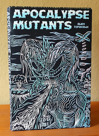


Gwen Tomahawk’s, Apocalypse Mutants (2015) opens up with a six-page wide folded cover, and then two pages with two-page extended flaps which leads into an off-center stapled gatefold spine, and finally a page with a two-page flap. When these folded elements are combined with the high-contrast aesthetics of its scratchboard imagery it almost feels as if you are holding a living thing in your hands.


Judex’s, Untitled (2008) opens with an off-center cover that extends across four pages, then two half-pages, after which it explodes in a ten-page-wide gatefold. On the reverse side is a six-page spread that joins with the inside of the back page which also includes a CD slipped into the back cover’s page fold. Once again, the high contrast, hand-drawn imagery coupled with the bright and saturated inks, produces a scintillating viewing experience for the reader.


 Vasijona, Maskulator, 2022
Vasijona’s, Maskulator (2022) has a traditional folded cover. Inside are six pages with one-page flaps and when each of these flaps are opened up it results in four four-page foldouts. What’s particularly interesting about this publication is that even the reverse sides of these four page fold-outs appear to cohere as complete images, helped by a drawing style that aids in creating a sense of a continuous image. This publication at first glance appears to be a relatively simple construction made from four screenprinted strips of the same size, in which the pages at each end have been folded into the former. However, the simplicity of the construction combined with the drawing style creates an unexpectedly complex and compelling graphzine.


Nico Fremz’s, Kamafoutraque (2022) has a very different and much simpler architecture. The work consists of two black and white leporellos each displaying a continuous black and white drawing that has been mounted onto the two insides of the folded cover, such that when you open up the work to the center spine there are two separate panoramic leporellos, one on the right and the left. When unfolded and viewed together the sexually charged black and white drawings, create one incredible mural-sized work, that is almost twenty-eight feet long.
Conclusion
Le Dernier Cri is a one-of-a-kind operation which, through the wonders of serigraphy, has been able to chart a totally independent path enabling Bolino and Sury to publish whatever they want, with whomever they want and in whatever experimental format they and the artists desire. Furthermore, through their publishing activity they have created an international community of fellow collaborators, all of whom have been willing participants in expanding the parameters of these artists’ publications by incorporating innovative and experimental folded formats into their graphzines.
As of 2025 LDC is still going strong with no sign of slowing down, and as the growing number of “out of stock” items in their online store attests, the popularity of their publications remains unabated.19
Stephen Perkins, copyright 2025
Footnotes
1. Virginie, Caroline Sury, Pat Z. & Loux (eds), Hello Happy Taxpayers, #0-10, 1981-1993
2. Revox, Eva, "Mosquite Bait," Bananafish, #13, 1999, p. 48
3. Ibid., p. 49
4. Ibid., p. 50. Le Dernier Cri published ten issues between 1993-1995
5. Ibid., p. 54. Hôpital Brut has published ten issues between 1997-2014
6. Graphzines: the APAAR years, Julye, 2016: https://www.contrebandes.net/
7. Néret, Xavier-Gilles, Graphzine/Graphzone, Le Dernier Cri/Editions du Sandre,
Marseille, 2019, p. 8
8. Ibid., p. 8
9. Ibid., p. 5
10. This figure from a listing titled "Catalogue des éditions: Le Dernier Cri 1993-2020," in:
Pakito Bolino (Direction), Mondo Dernier Cri: Une International Sérigrafike,
M.I.A.M., Sète, France 2020
11. Dubuffet's "La Collecition de l'Art Brut," is located in Lausanne, Switzerland
12. "The Last Scream since 1983," https://www.lederniercri.org/qui-sommes-nous/,
accessed 5.22.25
13. ibid., https://www.lederniercri.org/qui-sommes-nous/, accessed 5.22.25
14. For this text I'm utilizing a personal research archive of 60 of Le Dernier Cri's
predominantly screen printed publications spanning 30 years (1995-2025) of their
32 year existence (1993-2025). These publications break down into seven clearly
defined areas based on the manner in which they've been produced. Here is the list
that I created to outline the different features of each grouping, and the number
of items in each category:
Regular book format (14)
Periodicals (2)
Tarot card decks (8)
Traditional leporello (7)
Sandwich leporello series (5)
Double Gatefold leporellos (7)
Double Gatefold and Fold-Out(s) (17)
15. Each page in the Sandwich series is 12 cm (h) and 12 cms (w), and when each
work's seven double-sided pages are fulling opened along with the two covers,
its length is 109 cms (3ft 6.75"). The following link takes you to a listing of all
12 leporellos in this series:
https://www.graphzines.net/editeur/editions-le-dernier-cri/collection-sandwich
16. This list does not appear to be inclusive of all the leprellos Le Dernier Cri have
published since 1993, since one from 2019 is not listed at all. So, I have to assume
that this is a checklist only for the works in the exhibition, and that it's not a
comprehensive list of all their publications.
17. Jonathon Rosen, The Birth of Machine Consciousness, Le Dernier CriI, Marseille,
France, 2003, p. 2
18. One important element in the popularity of Le Dernier Cri's products is that they've
priced their limited edition works at very reasonable prices.