Sunday, April 14, 2024

Izumi Kato, Visible, Perrotin, New York, 2023


front cover

There's a weird kind of off-kilter feeling, but yet somehow right, about these pages of almost diaristic collages by the Tokyo & Hong Kong-based painter Izumi Kato (b. 1969). The eerie solitary extraterrestrial heads and figures that are a feature of his painting & sculpture practice, emerge here in the pages of this accordion. Visible, invisible, unseen, seen, and unseen — a map for a different future.

14 double-sided pages, individually 7" x  4.5", and when unfolded 5' 3".


reverse side


back cover


Rhea Karam, Somewhere/Elsewhere, Small Editions, New York City, 2023, ed. 500

front cover
'
With its spray painted covers this really fun accordion opens up gatefold style with two accordions that peal out from the center with page widths that increase incrementally in size. What I find so wonderful about this accordion, aside from its visuality and playfulness, is that Karam's series of abstract photographs makes it almost impossible to see where the individual pages start and end, and as a result the accordion seems to disappear in your hands. 

Here's a statement from Small Editions about this work:

"Somewhere/Elsewhere is a continuation of the artist book Parallel Planes (2022) It further explores the notion of lines and borders within the urban landscape. The unique structure of this book leads the viewer into a journey where they can navigate city streets through a series of photographs of textured architectural planes that coexist side by side. Each page acts like a layer that can be peeled back or overlapped, allowing the viewer to interact and construct their own visual landscape within an infinite amount of possible compositions. (There is no specific direction or order in which the book should be viewed, drawing a parallel with the abstract notion of constructed identity and displacement.)"

For more info about Rhea Karam: ARTIST BOOKS — RHEA KARAM

28 double-sided pages, standard height of 10.75" and widths varying from 4.75" - 8", and when unfolded 14' 2.5".


back cover

Thursday, March 28, 2024

Luc Jolivet (a.k.a. Norman Bambi), Out of Office, nos:books, Taiwan, 2021-2023, ed. 800

front cover

A fun and snappy little accordion that takes the measure of the discarded chairs in Taiwan and it documents how they become part of the city's urban landscape. On the inside of the album's cover is imprinted the following statement from the artist:

The fate of an office chair is to stay indoor at a desk, partner in boredom to the daily clerical routine.

In Taiwan, fortunate office chairs enjoy a better future outdoor: some are the best friend of a nap in the shade, others gather and share the midday gossip.

The harsh suns dims their hyper colors, and the tropical sweats polish their functional curves into the riddles of a life well spent.

A cool project and packaged in a format that matches its humble subject matter.

22 double-sided pages, individual pages 2" x 3", and when unfolded 5ft 6".


back cover


Tuesday, March 26, 2024

Tja Ling Hu, Before I Was Born, Jap Sam Books, Netherlands, 2020


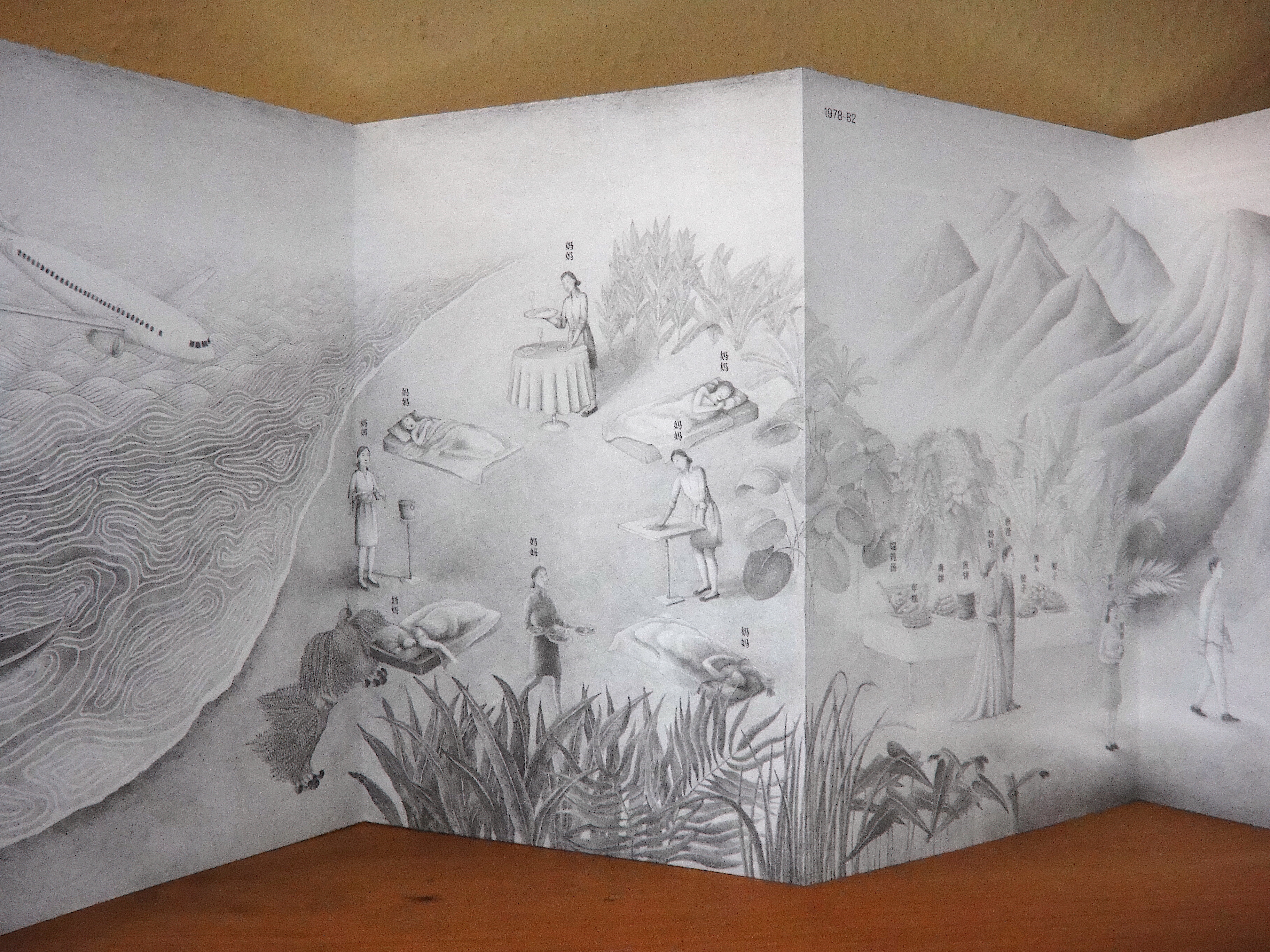
This beautifully drawn accordion is one continuous panorama in which Tja Ling depicts fourteen specific events from across four generations of her family's history from China to the Netherlands, between the years 1934 to 2017. The following is from the cover of the book: 

"Born in the Netherlands but of Chinese descent: growing up with Asian genes and ethics in a Western world, supporting her immigrant parents in their restaurant located in a Dutch village from a young age. On a quest looking for her own identity, visual artist Tja Ling Hu explores the duality of her origins, realising that the contrast between her life and those of her parents could not have been any bigger. Yet their story is also hers, as their migration from China to a faraway country would not only completely change their lives but shape those of their children.

In Before I Was Born, Tja Ling illustrates the story of her family's journey in 14 interconnected pencil drawings. Out of respect and admiration for the way her [grand]-parents built a life for themselves with all the challenges they have had to face, migrating without any formal education or knowledge of the local language."

On the reverse of each drawing is a list of names of the people depicted, along with the different countries they are in. For more information about Hu's work and to purchase this accordion: Tja Ling | Illustrations | Murals | Art | Kunst | Illustratie | Rotterdam

Note: click images for larger size for these subtle drawings.

30 double-sided pages, individually 10" x 6.75" and when unfolded 10ft 10.5"


reverse side with titles

close-up of reverse side

back cover
 

Sunday, March 24, 2024

Eric Mourier (font) and Knud Holten (text), The Myth about Bird B, College of Graphic Arts, Copenhagen, 1970

front cover

Eric Mourier (1939-2020) was a well-known Danish designer, who with his wife Mette Mourier opened their own design studio and they worked on a wide range of design projects with a special emphasis in book design. In 1999 they published "Book Design: Layout and Design of Illustrated Books," which remains a Danish standard to this day, and was reprinted in 2013.

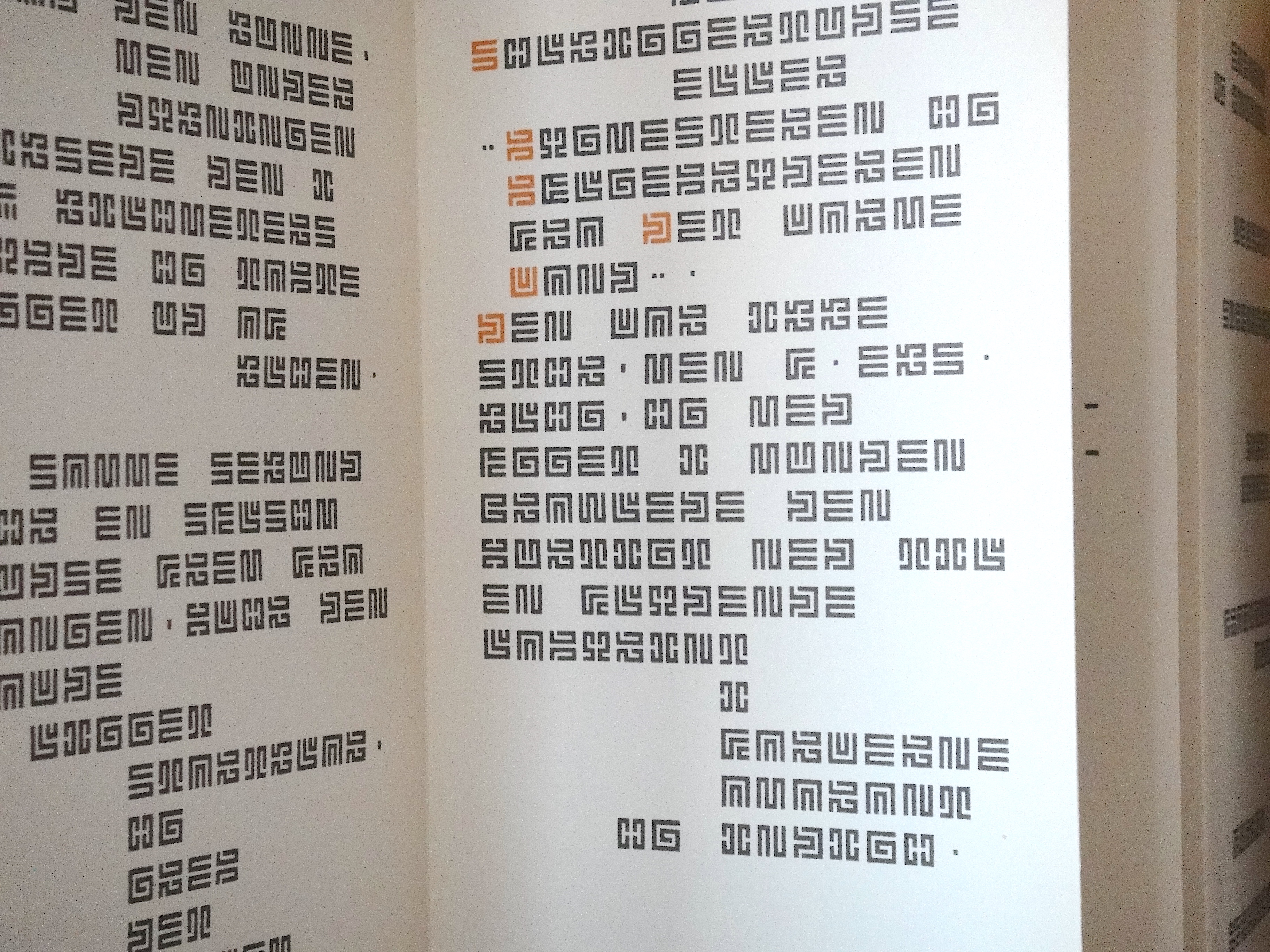
In a memorial tribute to the Mourier soon after his death the online editor addresses Mourier's own place in the history of typography & typographic design with the invention of his own abstracted typeface he called Mourier.  As to the nature of how he developed the typeface he stated, "About the lettering, it may be stated that the individual letters have been designed on the basis of a rigorous, detailed scheme: Forty-nine squares, black and white in rows alternately, no closed areas, gaps the size of one square, etc. Within this scheme, the aim has been to obtain the greatest possible likeness to ‘ordinary’ letters, and, simultaneous, a logical system of forms. The letters c and u, k and y, a and v, to exemplify, are identical, only variously turned".[Eric Mourier In Memoriam - Velvetyne]

Mourier invented this geometric abstracted alphabet in 1970 and its only use as a lead-caste font was in the present accordion in which it was used to write this story by his friend Knud Holten. Of this collaboration he wrote: "That the result was a folding book aesthetically motivated: Here the reader is not bound by individual spreads, but is given the opportunity to perceive the whole as such, an ornamental sequence of events." This is a rather insightful response from someone who was clearly used to looking at book spreads, but here he takes stock with what this folded medium offers him.  [quote from pamphlet accompanying the accordion]

In 2002 and with approval from Mourier, Sébastien Hayez adapts the font for the digital environment. Indeed, you can download the font right here!: Mourier Font · 1001 Fonts

I can't say I can decipher the words of this story depicted here, but it's certainly an intriguing font to look at, and within the context of the accordion format, strangely compelling.

33 single-sided pages, individually 8.25" x 3.75" and when unfolded 10ft 3.7"


Saturday, March 23, 2024

Gfeller & Hellsgård, Frimousse de la Suisse Française, Bongoût, Berlin, 2005

front cover

From the two partners who founded Bongoût publishing (1995-2012), this silkscreened artists' book with its four folded page sections, is a continual visual surprise. While not an accordion, there's a really delightful play with the folds and their sequencing which elevates it beyond that of a traditional book. 

15 double-sided pages, individually 6.25" X 5.75" with four pages with fold out page sections.


inside of back cover

back cover