Friday, October 9, 2020

Julian Tuwin, and Matgorzat Surowska & Joanna Ruszczk, Locomotive/IDEOLO, Centrala, Poland, 2015


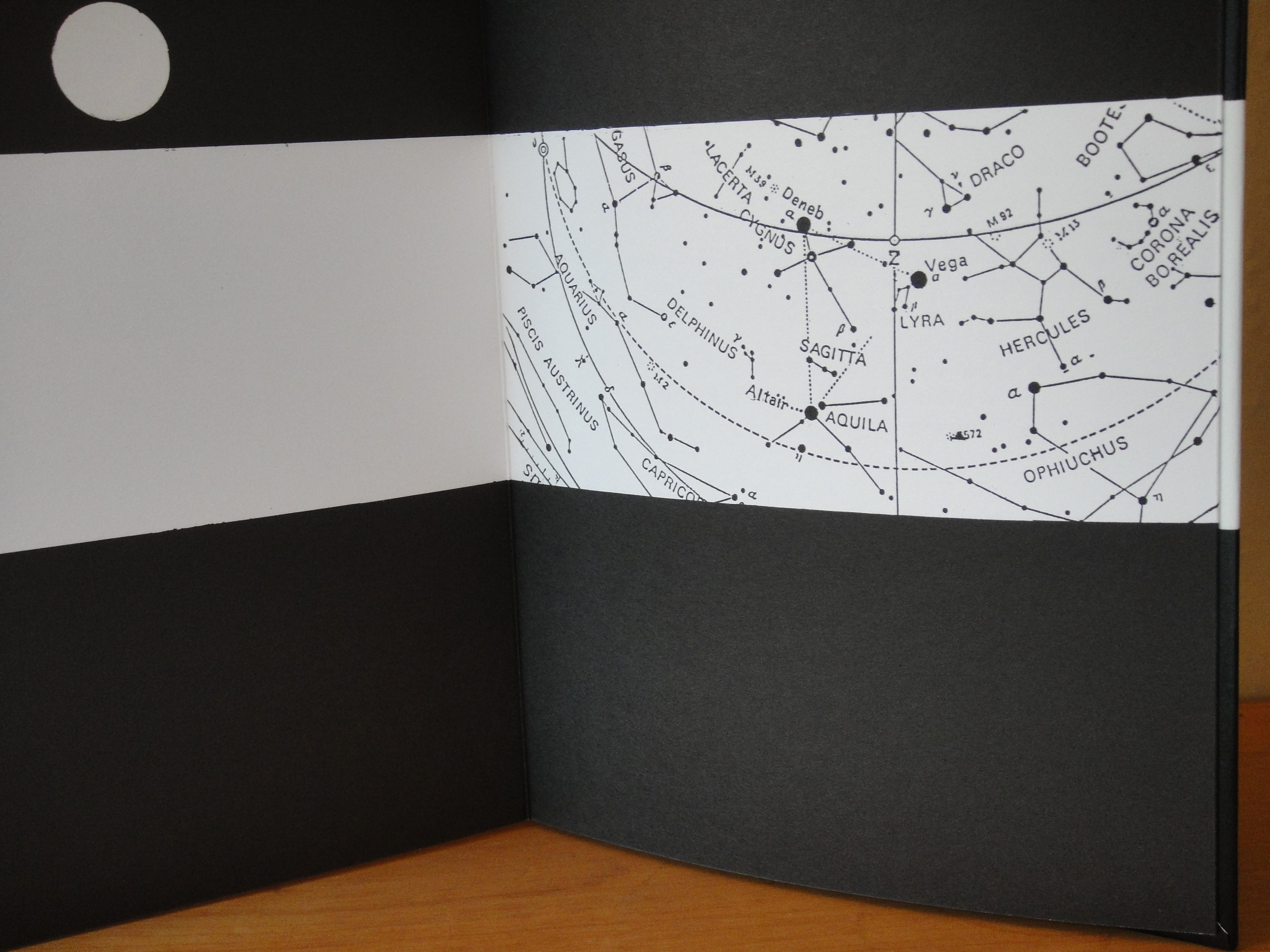
This is a really wonderful 78 foot accordion that takes as its cue a poem by the well-known Polish artist, Julian Tuwin (1894-1953) in which he describes a train and the varieties of things and people it was carrying in its 40 wagons.  Surowska and Rusczczk have brilliantly extended this idea into a train with 43 double-page wagons carrying a huge variety of people, animals and things. The black and white design works perfectly on the page and the graphics really pop. On the back of each page are texts related to that particular carriage and its contents, with all of them being concerned in some way with a variety of social, political, economic and aesthetic issues and themes, as well as a number of quotes by Tuwin.  

96 pages, double-sided, individual page 9.75" (t) x 9.75" (w), when fully opened 78 ft. 


Julian Tuwin, The Locomotive, 1938

sample of back page

on the floor and not fully extended either!


Monday, October 5, 2020

Cy Twombly, Fifty Days as Illam, Edition Cantz, Germany, 1990


An interesting accordion that reproduces this major work by Twombly. I particularly like how some of the images of the individual works wraparound the accordion's pages. Interestingly, this accordion has a central binding and the two halves of the work fold out from the center, kind of odd really. The work is located at the Philadelphia Museum of Art. The online label for the work states:

In the summer of 1977, Cy Twombly began working on a "painting in ten parts" based on Alexander Pope's translation of Homer's Iliad. Completed in 1978 and collectively titled Fifty Days at Iliam, the works evoke incidents from Homer's epic poem in Twombly's characteristic synthesis of words and images. The ten large canvases follow one another much like a developing narrative. They are ordered as follows: Shield of AchillesHeroes of the AchaeansVengeance of AchillesAchaeans in BattleThe Fire that Consumes All Before ItShades of Achilles, Patroclus, and HectorHouse of PriamIlians in BattleShades of Eternal NightHeroes of the Ilians.

16 pages, single-sided, individual pages 11.75" (h) x 8.25 (w), when fully open 11ft long.

For photographs of the work installed in the museum see:  

https://www.philamuseum.org/collections/permanent/85709.html


Warja Lavater (1913-2007), Tanabata, Adrien Maeght, Paris, 1994


Another of Lavater's pictographic accordions and this one recounts the story of Deneb, the king, who gives permission for the daughter of Vega to interrupt her celestial weaving and to leave for a bath in the luminous stream, the Milky Way. How can one resist a story such as this!  

The cover flap includes the chart for interpreting the pictographic images and is a guide to all the characters, players and locations in the story. Look for the other two Lavater accordions on this blog.

Warja Lavater (1913-2007) was a Swiss illustrator and designer who adopted the accordion format for all her artists' books. A neglected contemporary of Edward Ruscha, she published her first artists' book (William Tell) in 1962, the same year Ruscha published his first (26 Gasoline Stations), and perhaps more significantly the same year as Etel Adnan created her first accordion book.

17 pages, double-sided, individual pages 8.5" (h) x 5.5" (w), when fully open 7ft 9.5".

the chart with the guide to her pictographic language


reverse side

map showing location of Deneb and Vega


Thursday, October 1, 2020

Joe Tilson, Proscinemi Oracles, Edizioni del Cavallino, Venice, 1981, ed. 200

I was really excited to come across this wonderful accordion by the Brit artist Joe Tilson (1928-2023). A prominent member of the British Pop Art scene in London, he enjoyed enormous success, later reflecting "...I loved it, because I was young and cocky and good and felt I deserved all that. Then it all went away. You can't work too closely to fame...". Later in the decade (1960s) he turned to explicitly political subject matter in response to the war in Vietnam. 

At the beginning of the 1970s Tilson and his wife moved out to the country, and a new language of ecology enters his works, with a parallel interest in Greek myth, and the idea of the labyrinth. These new interests were also in reaction to his more recent political period, from which he had concluded  that "...politics was not the way forward. It was very brief and a complete waste of time. Mixing art and politics is a bad idea: I was stupid and young". 

Many of the individual images in this accordion can be found in Tilson's similarly named print series "Proscinemi Oracles," (1975-78). I take the title to mean the 'place, or theatre, or space of the oracles,' and like the prints, certain images recur including photographs of hands, shoes, as well as labyrinths and pomegranates. Both these sets of work address issues around our relationship to the earth, all framed within the larger world of the wisdom of the ancient oracles. 

This accordion is one in a great series titled "Cahiers de Poche" (pocket notebooks) published by Cavallino Edizioni D'Arte (1934-2010). There are 21 accordions in this series, and with their matchless technical excellence its no surprise there are only a few available for purchase. For a full list:

https://www.edizionicavallino.it/pages/collana/elenco_titoli.Cahiers-de-Poche-Libri-litografia-firmati.html

44 pages, single-sided, individual pages 5.75" (h) x 4" (w), when fully opened 7ft 4".


Wednesday, September 30, 2020

Albert Merz, Tensio interna, Voix Editions, France, 1987, ed. 180


A funky, scratchy and slightly unsettling drawing that kind of insolantly sprawls across the pages of Merz's accordion. Born in Switzerland in 1942, he moved to Berlin in 1980 where he now lives and works. About his work he says:

Man is a mystery, and has his secrets. He is abysmal, vulnerable, yearning and in need of love, constantly searching for the meaning of life. In my work I try to find signs for all of this.

This publication comes from Richard Meier's Voix editions which is a well known publishing house. Merz's book is just one in a series of over 19 accordions that Meier published which featured artists' drawings — my hat's off to him for this singular accomplishment and this support in furthering the cause of artists' accordion publications.

8 pages, single-sided, individual page 11" (h) x 8.25" (w), and when fully open 5ft 6".


back cover

Wednesday, September 23, 2020

Masato Nakamura, QSC+mV, Imschoot, Ghent, Belgium, 2001, ed. 1000


This is the first accordion that i've come across that has been printed on clear plastic! This book accompanied Nakamura's installation in the Japanese Pavilion at the 49th Venice Bienniale (2001) in which he constructed large McDonald's golden arches that filled the exhibition space (see below). The title of the book "QSC+mV" is a play on McDonald's original corporate philosophy of 'Quality, Service and Cleanness make Value,' which Nakamura has changed to 'Quality, Sincerity and Communications and the coefficient m is multiplied by Value to mean art'.

The project came to him after a world trip in 1996, stating:

"After developing the pictures I took, I noticed yellow Ms in many of the shots. It didn't matter what country I was in-there they were....Golden arches are a symbol of heaven and passing under an arch signifies rebirth. Arches symbolize victory, and mark the entryway to sacred spaces. But as everyone knows, arches which look like this signify only one thing: a dependable burger. The wonder of the Big Mac is that it tastes the same wherever you are....I had the feeling that this living creature (earth) was transforming, with Ms appearing all over its surface, almost like blemishes."

A unique publication, and part of a larger project that I'm assuming is not only an exploration of this worldwide symbol, but an attempt to deconstruct its larger symbolic, economic and gastronomic meanings.

4 accordions, i) 2 pages, ii) 3 pages, iv) 4 pages, v) 6 pages, individual pages 8.25" (h) x 5.75" (w), total lengths variable.


Nakamura's installation in the Japanese Pavilion, 
49th Venice Bienniale, 2001, Venice, Italy.

Sol LeWitt, Lignes en Quatre Directions et Toutes Leurs Combinaisons (Lines in Four Directions and All Their Combinations), Museé D'Art Contemporain CAPC Entrepôt Laine Bordeaux, France, 1983


A cool catalogue for this installation/exhibition of a work by LeWitt (1928-2007). An early conceptual and minimalist artist who reduced his palette to some very basic shapes — spheres, quadrilaterals and triangles, and a similarly limited color palette of red, yellow, blue and black. With respect to how he got to this point in reducing art to its essentials, he said he wanted "to recreate art, to start from square one."

The title of this catalogue, and of this exhibition are typical of the titles he gave his works, and in this instance its "Lines in Four Directions and All Their Combinations."  Taking this as the conceptual framework for the piece LeWitt proceeded to explore all the many combinations possible within this recipe.  This catalogue, which includes the results of these instructions and photographs of helpers installing the works, gives a clear and fascinating introduction to the work of this important late 20th century minimalist artist.

36 pages, double-sided, individual page 8.5" (h) x 8.75" (w) and when fully opened 13ft 1.5".

note: this article was informed by Michael Kimmelamn's obituary of LeWitt titled "Sol LeWitt, Master of Conceptualism, Dies at 78," New York Times, April 9, 2007

front

back


back cover