Warja Lavater (1913-2007) was born in Winterthur, Switzerland and studied graphic design from 1931 to 1935 at the prestigious Zurich Kunstgewerbeschule (School of Applied Art). One of her teachers was Ernst Keller, who was well regarded for pioneering the International Typographic Style and would later become known as the "father of Swiss graphics." Reflecting on her experience with Keller, Lavater would later recall:
"What we were learning was design, and so we began with the most important thing, drawing. Where do you put a sign in a rectangle? What is the standard solution to this exercise? Should the strongest element be the sign or the drawing? How can both be distinguished at a distance, yet integrated in a composition?"
Lavater married another graphic designer, Gottfied Honegger, and from 1937 to 1958 they ran a graphic design studio in Zurich concentrating on designing symbols, logos and trademarks. Lavater also worked as an illustrator for the young person's magazine Jeunesse from 1944-1958. In 1958, the couple moved to New York for three years and she found work designing scientific illustrations for Dell Publishing.
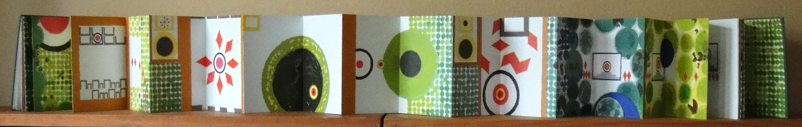
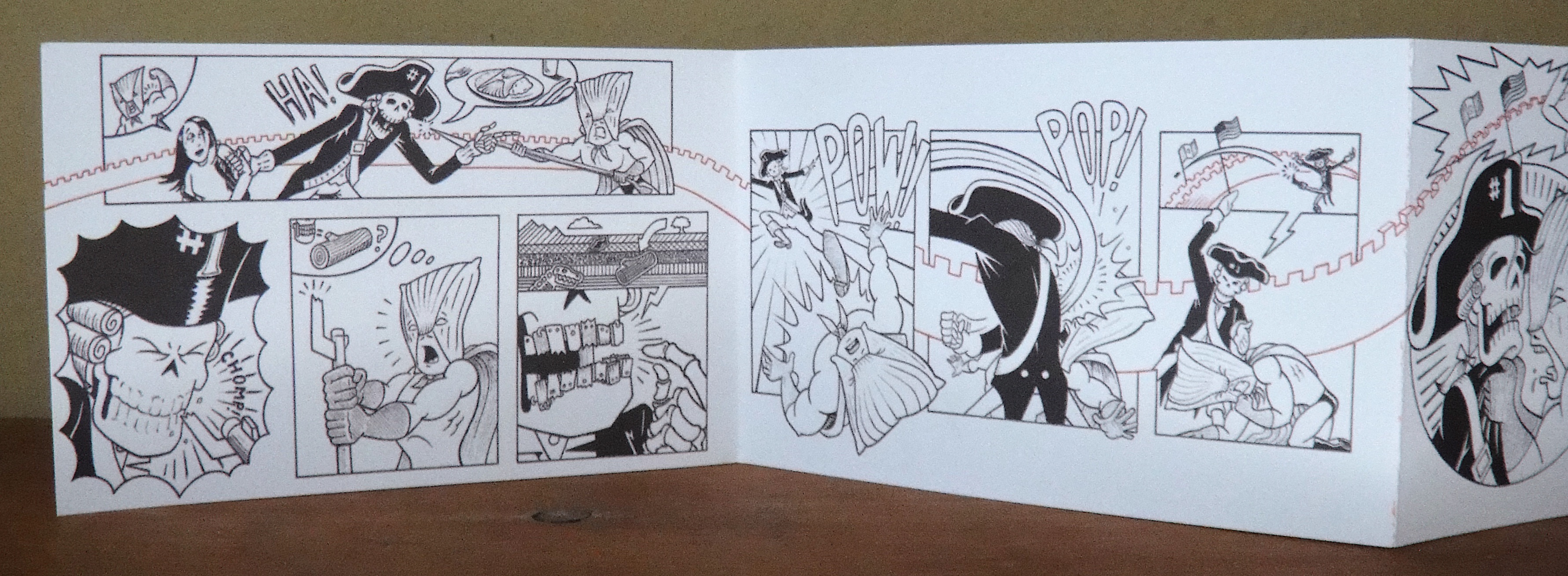
It was in New York, and stimulated by this new advertising and commercial environment, that she began to experiment with using pictograms to represent well-known children's stories. According to one writer it was after visits to New York's Chinatown that she saw the books used by Chinese calligraphers and she became "...enthralled with the mobility and versatility of this unique format that stretched like an accordion."
Lavater would adopt this format for all her artists' books for the rest of her career, and in the process she created books that appealed to viewers unbound by the constraints of any particular language. Lavater described her books as imageries, and her use of this particular kind of visual language as a way to:
"...express certain attitudes and actions, not by illustrating, but by writing picture-poems or 'pictograms.' We react to visual signs more effectively than to anything else, and I felt able to write by using such signals as codes, as signs that communicate... each story has its own 'code', signs that are easy to understand and that do not require a particular verbal language."
In 1962, the Museum of Modern Art published her book William Tell in an accordion format that allowed the story to unfold chronologically, using only symbols to tell the narrative. The book sold out as soon as it became available. From that time onwards she published over 40 different accordion books, using this pictographic style and with each book accompanied with an index to the different symbols she used in each story. Many of her books were published in different languages, and clearly her pictographic style allowed a diverse audience of all ages to appreciate and enjoy her purely visual books.
Lavater described herself as a Bildstellerin, or "picture writer" and the following quote by Carol Ribi from 100 Years of Swiss Design locates her work at a fascinating intersection between a variety of representational systems: "Warja Lavater's symbol notations and artists' books are situated on the boundaries of graphic design, painting, literature, and object art, and there mark a transition of genres that has yet to be thoroughly explored in picture or art theory."
Apparently, Lavater often compared her artists' books with other artforms, with a special attention to film, and considering that there is a similarity between the frame by frame of accordion books and that of film, it comes as no surprise to discover that at the age of 82 she turned some of her pictograms into a series of six short digital animation films set to music by the French composer Pierre Charvet.
At the time of her death Lavater was living in Zurich and her estate is held by the Zurich Central Library.
______________________________________________________
Little Red Riding Hood, The Museum of Modern Art,
New York, 1965/1971
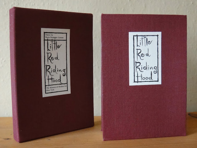
Accordion with slip cover
see index of book's symbols on the right page
two images of the accordion opened
back cover
Dimensions: 42 single-sided pages, individual pages 6" x 4",
and when fully open 14 feet.
______________________________________________________
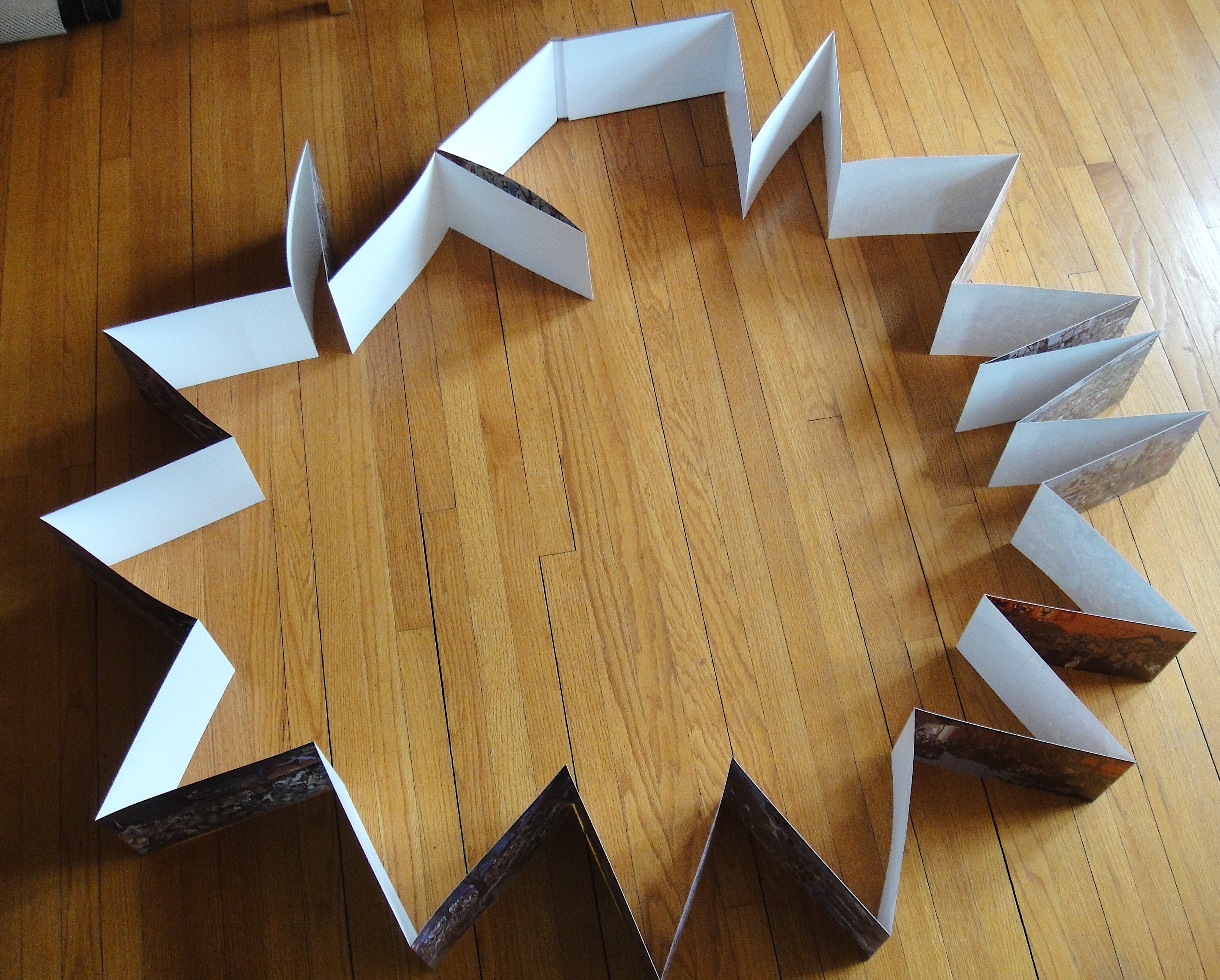
Snow White, The Museum of Modern Art, New York, 1974
accordion with plexi slip cover
two images of the accordion opened
back cover
Dimensions: 41 single-sided pages, individual pages 6" x 4.25",
and when fully open 14ft 6.25"
________________________________________________
OURASIMA [Tale of a Japanese fisherman], Adrien Maeght, Paris, 1991
Accordion with plexi slip cover
Dimensions: 39 double-sided pages, individual pages 6.25" x 4.25",
and when fully open 13ft 9.25"


 Bucher standing in front of her installation at the Museum of Art, Lucerne