Tuesday, November 2, 2021

Michael McKeown, Bushwick 66, self-published, nd


The statement on the back cover of this accordion explains everything about this unique area of McKeown's artistic practice!

"Michael McKeown constructs large-scale sculptures of found materials and trashcans, designed as parodies of weapons of mass destruction. McKeown's work offers a socio-political critique of global militarization, particularly drawing on his memories of the Cold War and the consequences of global nuclear armament. His choice of materials and inventive designs address with tongue-in-cheek the artist's understanding of the "colossal waste of resources" that the global arms race perpetuates."

5 pages double-sided, individual pages 6" x 3.5" and when fully open 1' 5.5".


reverse side

back cover


Pacifico Silano, I Wish I Never Saw The Sunshine, Loose Joints, London, UK, 2021


This is a really smart conceptually-based accordion that reworks gay printed ephemera in a manner that really utilizes the opportunities opened up by the accordion format. Also included in this book is a very informative interview conducted with Silano by José Diaz about his interests and the larger background to this book. This accordion is named after the 1976 song by the Ronettes which is about a girl who's devastated at the ending of a love affair, and these themes resonate throughout Silano's book as well.

Below is a really concise synopsis of the book that I found on the website 'Grenade in a Jar Books' (grenadinajar.com) by an anonymous author.

"American conceptual artist Pacifico Silano’s practice is rooted in excavating the printed ephemera of gay culture to create new images that comment on loss, longing and queer melancholy. In particular, Silano uses the gestures of framing, cropping and layering vintage gay erotica to comment on the HIV/AIDS crisis and its reverberations on queer lives, which included the loss of the artist's uncle at the height of the epidemic.

I Wish I Never Saw the Sunshine is Silano’s first artist’s book, and engages with an ambitious accordion-folded format that references Silano’s photo-based installations: two twenty-panel long sequences that can be read as both one continuous collage and a sequence of individual images. Included in the book is an interview with the artist by José Diaz, Chief Curator of The Andy Warhol Museum."

39 pages in total, double-sided, individual pages 10" x 8", and when fully open 26'.


back cover


Monday, November 1, 2021

Bernard Heidsieck, Abécédaire #6 'Clef de Sol' (Treble Clef), Les Presses du Reel, France, 2015

the slip cover for the accordion

Bernard Heidsieck (1928-2014) was a French pioneer of sound poetry, and as can be seen in this work he has combined the individual letters of the alphabet with musical staves to create an expanded musical & visual sound composition. 

Bernard Heidsieck was born in Paris in 1928. A graduate of the Istituto Politico, he is the deptuy-manager of a large Parisian bank. He has been interested in sound poetry since 1955 and since 1962 in action-poetry. In 1955 the first "Poèmes-Partitions" and after 1959 use of the tape-recorder as a means of composition and retransmission. Between 1966 and 1969 he composed 13 "Biopsies", since 1969 23 "Passepartout."

This above short introduction to the man and his work by Steve McCaffery is part of a longer appreciation that can be found here: 


26 pages, one-sided, individual pages 9" x 6.75" and when opened up 14' 7.5."

slip cover and accordion

first page of the accordion


back cover

Frédéric Teschner, Le Havre, Franciscopolis Editions, Le Havre, France, 2013


A rather interesting work by the poster artist Teschner, who was invited by the University of Havre to make a portrait of Le Havre in connection with a retrospective of his work. Visiting the port town in northern France, that was all but wiped off the map by British bombers during WWII, he discovered a windbreak that was 250 meters long, and 20 meters high. The windbreak was originally built to shelter ships at birth in the harbor at Le Havre, and it also resonates with the meaning of 'havre' as 'shelter.' This work reproduces all five of the quite complex posters he created for the project, as well as images of enlarged versions of the works installed onto the top the windbreak.

This accordion is accompanied by two essays, both reproduced in French and English that go into greater detail about the work and the history of this French port city.

6 pages double-sided, individual pages 12" x 8.25", and when fully open 4' 1.5".


reverse side

the windbreak with the posters works on top of the wall

back cover


Saturday, October 30, 2021

Alfonson Barrera, Mascaras, 2016/2021, Polvoh Press, Oaxaca, Mexico, ed. 500


While I would not define this artists' book as an accordion, there are some accordion-like features that appear when the series of folded pages found throughout this book are opened up. My definition of an accordion is a work that has two or more folds, and thus the various fold-outs in this publication meet that definition. Either way this book, printed on thick card, is a lively and engaging series of faces all decorated in a number of different 'mascaras.'

6.25" tall, and 5.25" wide, with 25 pages, 8 color silkscreen, with folded covers. For another book from this press check out Barrera's 'Random Spleen,' 2019.


last page with inside of folded back cover

back cover


Friday, October 29, 2021

Féros, #4, 2019, France, ed. 500


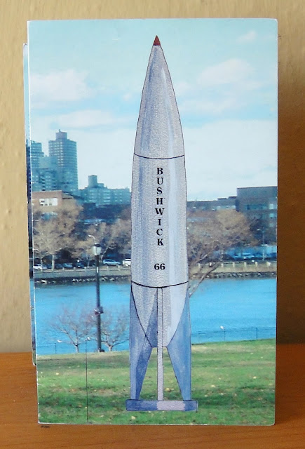
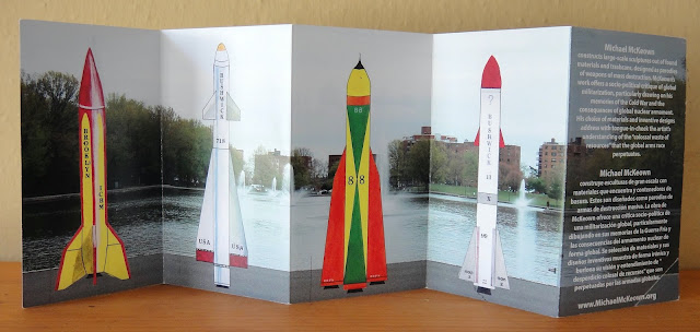
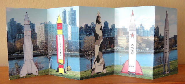
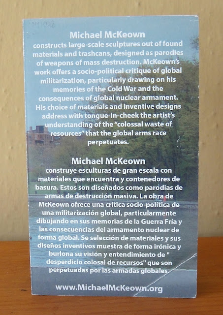
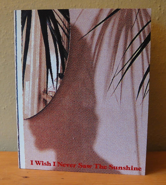
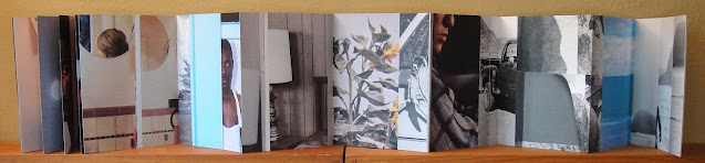
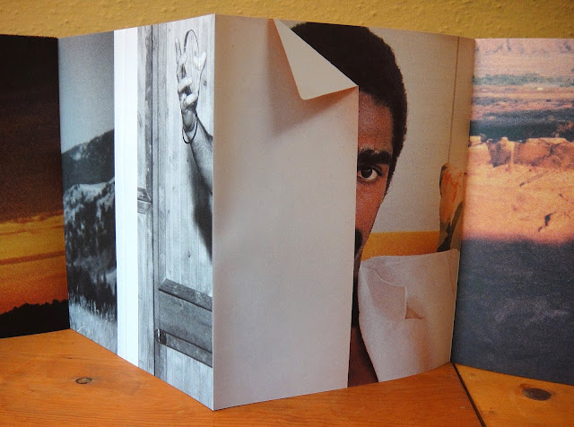
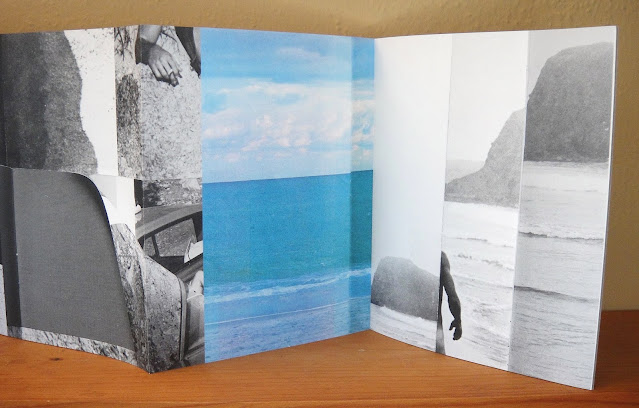
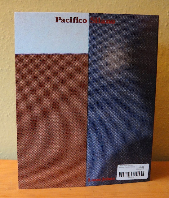
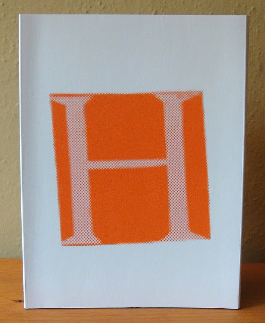
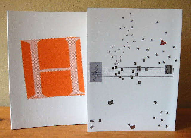
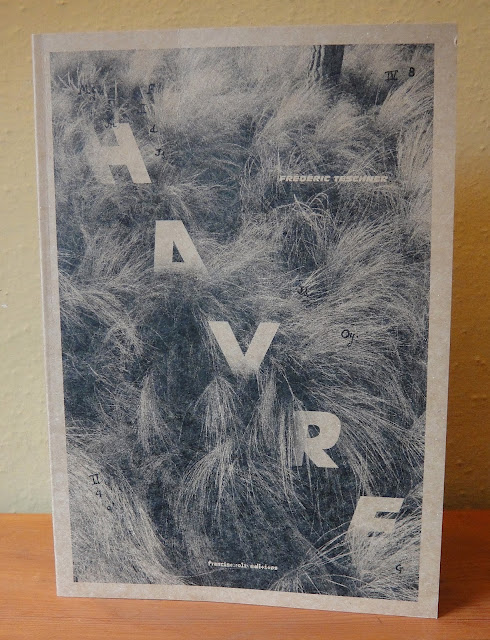
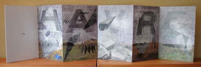
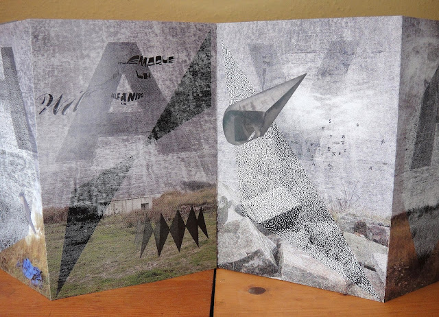
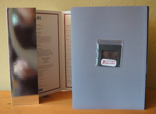
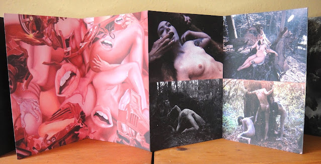
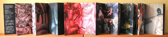
Féros is one of the very few contemporary erotic accordions that I have come across, so I tip my hat to the editors Florence Andoka and Clement Gagliano for its run of 5 yearly issues between 2015-2020, and in particular this cool special accordion issue. The accordion comes separately from the sharp silver cover that encloses it, and it also comes with two inserts, with the slide on the front cover revealing a vulva, and there's a photographic print of an uncircumcised penis further inside the issue. Accompanying the publication is a folded brochure with images of each artists' work and their name, as well as a small card with an editorial for issue #4 (illustrated below).

Here is a description of the magazine from their distributor's website, les presses du réel, in Dijon, France:

"Féros is an erotic magazine. Sometimes sensual, sometimes sexual, Féros calls to senses to awaken. Contemporary by definition, it explores with an obsessive eye aesthetic and contemporary fascinations for instinct in human nature. Its publication imposes the need to reveal the principles at stake in a contemporary vision of Eros, which is constantly seeking for and redefining itself, without interference. Féros only includes visual arts, symbolic projects. Polyphonic and composite, Féros puts yearly its focus on a specific theme. In each issue, pieces of arts and literature intertwine, interact freely and in a harmonized dialogue. Wild and rare beauty: Féros.

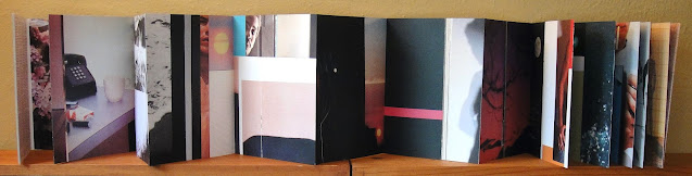
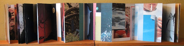
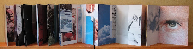
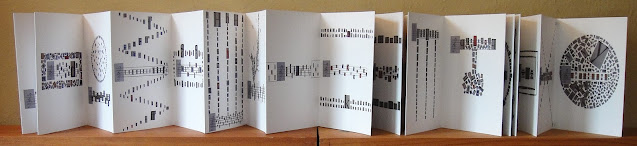
Published between 2015 and 2020, Féros was a hybrid form, intertwining artist book, magazine and bibliophilic book. It tends to give clues on contemporary sexualities and erotic practices through an aesthetic prism and from a contemporary art point of view. It explores the boundaries and links between erotica and pornography, sexuality and sensuality, as much as the distinctions between desired and desiring entities. Leaving the door open on purpose, Féros does not pretend to give a sociological answer or a single way to go on the subject, but rather draws a panoramic view, via a specific curating on the edition of each issue, of nowadays practices and representation types of Eros. The final objects thus takes the form of an exhibition, built through pages that viewers may touch and turn, a physical space including its own restriction and advantages, artistic as well as aesthetic. Both visual and tactile experiment, the artworks, printed on the peculiar skin that is paper, are driven together, can apprehend each other and can freely dialogue over the pages."

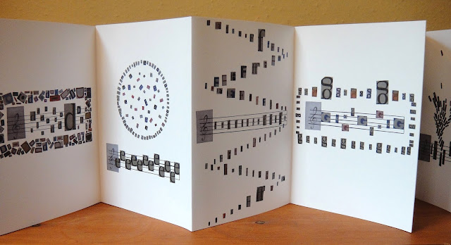
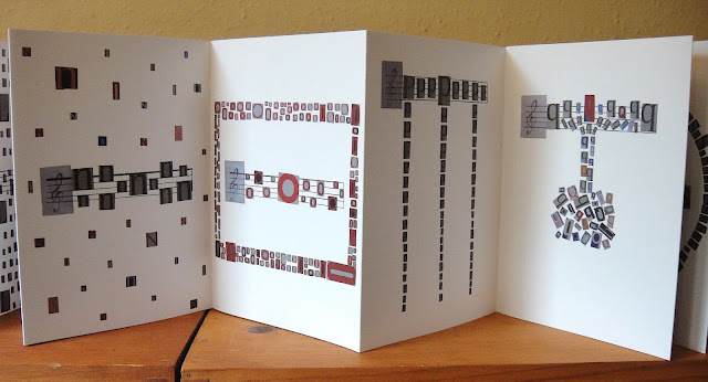
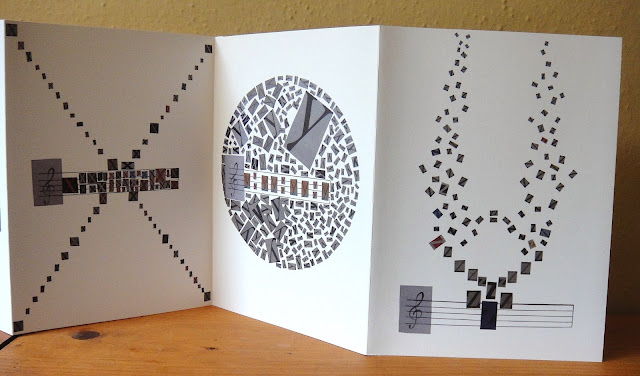
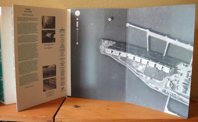
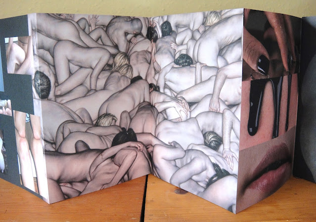
22 double-sided pages, individual pages 9.5" x 6.75", and when fully opened 12' 4.5".
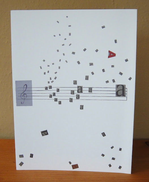
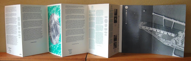


reverse side


editorial statement for this issue #4


back cover with list of contributor's names


Lauren Emeritz, Hand Carved Alphabet, Abstract Orange Press, Washington DC, 2016, ed. 300


A cute miniature alphabet book hand carved from wood. Emeritz is a book artist, letterpress printer and graphic artist who founded and runs the Abstract Orange Press. She creates prints and books by hand using a Vandercook press and wood type, including type she designs and carves herself. [The Kelmscott Bookshop].

28 single-sided pages, individual pages 2" x 1.5", and when fully open 3' 6".


end pages