Thursday, October 1, 2020

Joe Tilson, Proscinemi Oracles, Edizioni del Cavallino, Venice, 1981, ed. 200

I was really excited to come across this wonderful accordion by the Brit artist Joe Tilson (1928-2023). A prominent member of the British Pop Art scene in London, he enjoyed enormous success, later reflecting "...I loved it, because I was young and cocky and good and felt I deserved all that. Then it all went away. You can't work too closely to fame...". Later in the decade (1960s) he turned to explicitly political subject matter in response to the war in Vietnam. 

At the beginning of the 1970s Tilson and his wife moved out to the country, and a new language of ecology enters his works, with a parallel interest in Greek myth, and the idea of the labyrinth. These new interests were also in reaction to his more recent political period, from which he had concluded  that "...politics was not the way forward. It was very brief and a complete waste of time. Mixing art and politics is a bad idea: I was stupid and young". 

Many of the individual images in this accordion can be found in Tilson's similarly named print series "Proscinemi Oracles," (1975-78). I take the title to mean the 'place, or theatre, or space of the oracles,' and like the prints, certain images recur including photographs of hands, shoes, as well as labyrinths and pomegranates. Both these sets of work address issues around our relationship to the earth, all framed within the larger world of the wisdom of the ancient oracles. 

This accordion is one in a great series titled "Cahiers de Poche" (pocket notebooks) published by Cavallino Edizioni D'Arte (1934-2010). There are 21 accordions in this series, and with their matchless technical excellence its no surprise there are only a few available for purchase. For a full list:

https://www.edizionicavallino.it/pages/collana/elenco_titoli.Cahiers-de-Poche-Libri-litografia-firmati.html

44 pages, single-sided, individual pages 5.75" (h) x 4" (w), when fully opened 7ft 4".


Wednesday, September 30, 2020

Albert Merz, Tensio interna, Voix Editions, France, 1987, ed. 180


A funky, scratchy and slightly unsettling drawing that kind of insolantly sprawls across the pages of Merz's accordion. Born in Switzerland in 1942, he moved to Berlin in 1980 where he now lives and works. About his work he says:

Man is a mystery, and has his secrets. He is abysmal, vulnerable, yearning and in need of love, constantly searching for the meaning of life. In my work I try to find signs for all of this.

This publication comes from Richard Meier's Voix editions which is a well known publishing house. Merz's book is just one in a series of over 19 accordions that Meier published which featured artists' drawings — my hat's off to him for this singular accomplishment and this support in furthering the cause of artists' accordion publications.

8 pages, single-sided, individual page 11" (h) x 8.25" (w), and when fully open 5ft 6".


back cover

Wednesday, September 23, 2020

Masato Nakamura, QSC+mV, Imschoot, Ghent, Belgium, 2001, ed. 1000


This is the first accordion that i've come across that has been printed on clear plastic! This book accompanied Nakamura's installation in the Japanese Pavilion at the 49th Venice Bienniale (2001) in which he constructed large McDonald's golden arches that filled the exhibition space (see below). The title of the book "QSC+mV" is a play on McDonald's original corporate philosophy of 'Quality, Service and Cleanness make Value,' which Nakamura has changed to 'Quality, Sincerity and Communications and the coefficient m is multiplied by Value to mean art'.

The project came to him after a world trip in 1996, stating:

"After developing the pictures I took, I noticed yellow Ms in many of the shots. It didn't matter what country I was in-there they were....Golden arches are a symbol of heaven and passing under an arch signifies rebirth. Arches symbolize victory, and mark the entryway to sacred spaces. But as everyone knows, arches which look like this signify only one thing: a dependable burger. The wonder of the Big Mac is that it tastes the same wherever you are....I had the feeling that this living creature (earth) was transforming, with Ms appearing all over its surface, almost like blemishes."

A unique publication, and part of a larger project that I'm assuming is not only an exploration of this worldwide symbol, but an attempt to deconstruct its larger symbolic, economic and gastronomic meanings.

4 accordions, i) 2 pages, ii) 3 pages, iv) 4 pages, v) 6 pages, individual pages 8.25" (h) x 5.75" (w), total lengths variable.


Nakamura's installation in the Japanese Pavilion, 
49th Venice Bienniale, 2001, Venice, Italy.

Sol LeWitt, Lignes en Quatre Directions et Toutes Leurs Combinaisons (Lines in Four Directions and All Their Combinations), MuseƩ D'Art Contemporain CAPC EntrepƓt Laine Bordeaux, France, 1983


A cool catalogue for this installation/exhibition of a work by LeWitt (1928-2007). An early conceptual and minimalist artist who reduced his palette to some very basic shapes — spheres, quadrilaterals and triangles, and a similarly limited color palette of red, yellow, blue and black. With respect to how he got to this point in reducing art to its essentials, he said he wanted "to recreate art, to start from square one."

The title of this catalogue, and of this exhibition are typical of the titles he gave his works, and in this instance its "Lines in Four Directions and All Their Combinations."  Taking this as the conceptual framework for the piece LeWitt proceeded to explore all the many combinations possible within this recipe.  This catalogue, which includes the results of these instructions and photographs of helpers installing the works, gives a clear and fascinating introduction to the work of this important late 20th century minimalist artist.

36 pages, double-sided, individual page 8.5" (h) x 8.75" (w) and when fully opened 13ft 1.5".

note: this article was informed by Michael Kimmelamn's obituary of LeWitt titled "Sol LeWitt, Master of Conceptualism, Dies at 78," New York Times, April 9, 2007

front

back


back cover

Tuesday, September 22, 2020

Karl Holmqvist, Syline is the By-Linezz, Motto Books, Berlin, 2014, ed. 800

A mass of texts, letters, words, sense-nonsense sentences, repetitions, patterns, empty spaces, symbols and numbers all coalesce in this work to create a panorama of language as material piled up on top of each other all higgledy-piggledy. This mass of language matter also creates a skyline through the assorted language buildings that spring up and down this work. It's a visual feast in black and white.

Holmqvist is originally from Sweden, and then via Paris, arrived in New York in 1989 and quickly got involved with the alternative art and performance scene in that city. Known for his text-based works, readings and poetry he has exhibited internationally. Of his practice he states: "I always said that I was reading poetry as a form of visual art: as a form of invisible visual art, or as a form of Everyman's visual art....I consider myself more of an artist working with language and poetry, rather than a poet trying to have art shows or something like that". [Kayla Guthrie, "Words are People: Q+A with Karl Holmqvist," Art in America, June 7, 2012]

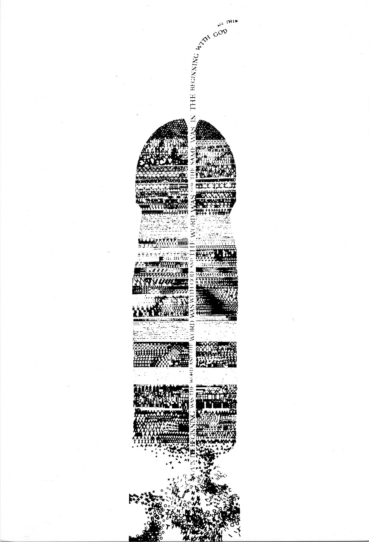
A unique accordion and sure to be appreciated by the language as material workers. I was repeatedly reminded of the 'wordscapes' of John Furnival, a British artist, who sadly has just left us (1933-2020). See a work of his at the end of this blog post.

20 pages, double-sided, individual page 9.5" (h) x 6.75" (w), when fully opened 5ft 7.5".


front

reverse


John Furnival, In the Beginning, artists' postcard, Fete de la Lettre, Paris, nd.

Friday, September 18, 2020

Billy Ocallaghan, Lucky, improper printing, 2017, ed. open


A fascinating accordion by this Irish writer that traces how far back you have to go in your family history to be connected to 1 million people — the answer is 20 generations. This accordion gives physical form to the answer to that question.  

About his work O'Callaghan states:

as a project-based artist, i investigate critical issues of our time (that interest me - e.g., extinction, queer and sexual politics, our debt to plants), prepare visual reports with my findings, and self-publish these in a variety of formats. using a number of related strategies for engagement (craft, informality, fun, humor, play, insight, and beauty), i hope to draw myself and others into deeper thinking around the subjects i'm investigating...

For another of O'Callaghan's 'visual reports' on this blog see: https://accordionpublications.blogspot.com/2020/01/billy-ocallaghan-inverted-rainbow-hue.html

Single-sided, 44 pages, individual page 3.75" (h) x 2.25" (w), when fully opened 8ft 7.5"


back cover

Simon Cutts with watercolors by Kate Van Houten, In Nannycatch Beck, Coracle Press, Ireland, 2017


Another beauty from Coracle Press with sparse, but pregnant words by Cutts, and watercolor pebbles by Van Houten in all their watery glory and 'thingness' set amongst the white expanses of the page.

10 pages, double-sided, individual page 4.5" (h) x 3.75" (w), and when fully open 1ft 6.75".

front

back

inside back cover