Friday, June 3, 2022

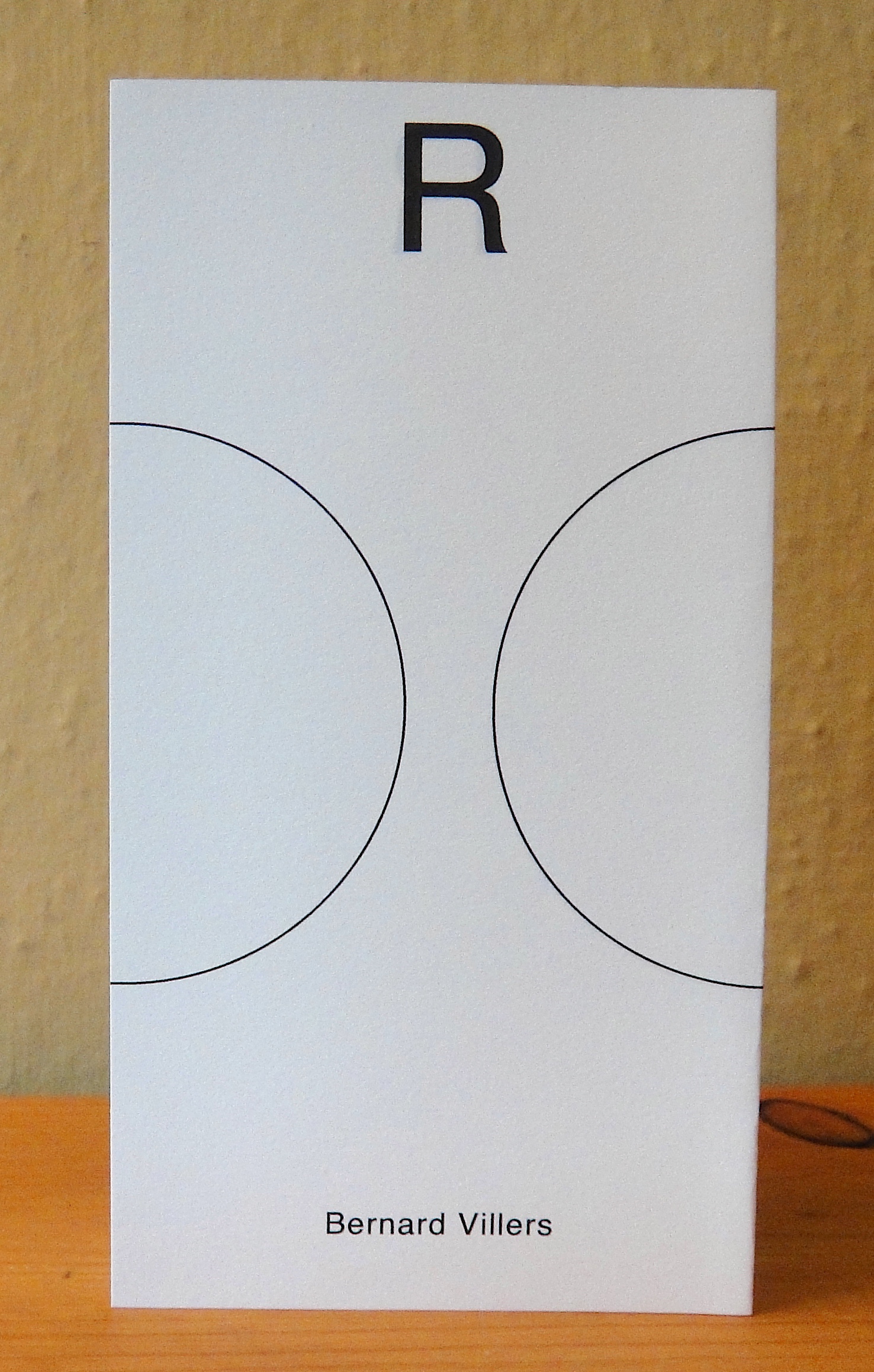
Bernard Villers, Le Nouveau Remorqueur & Bruno Robbe Editions, Brussels, 2016-2012

This post features seven accordion works by this Belgian artist who was born in 1939 and currently lives & works in Brussels. Trained as a painter at the L'Ecole national superieure des arts visuels de La Cambre (Le Cambre) he developed a painting practice that took the medium itself as the subject of his paintings, and he subsequently started examining the relationship between painting and its support structure, as well as color. Indeed, color would become the central feature in his painterly research, and in due course extended to his sculptural and bookmaking activities.

In 1976 he turned his attention to publishing his own works via three successive publishing houses, Le Remorqueur (The Tugboat): 1976-2003, Le Nouveaux Remorqueur: 2002-2015, and Le Dernier Remorqueur: 2016 onwards. With the exception of Leporello, published by Bruno Robbe Editions,1990, all the other works featured here were published under Villers' own imprint.

When asked about the relationship between his artists' books and his paintings he replied that they were "...a way of painting, an extension of my painting." And when he introduced a fold into his monochrome works he realized that the "...fold gives the monochrome different aspects...", and further that "You fold a sheet of paper, the idea of a book is born, that's where it starts," concluding, "So the fold is very important to me."

As can be seen in the works accompanying this post, the 'fold' is essential to his experimentation with his books and paper works, and it's evident that his previous mode of pictorial research into the support structure of paintings has now been applied to the more than 150 folded books, accordions and assorted paper works he's published.

For further information about Villers I recommend the catalogue raisonne titled Bernard Villers: Les Editions du Nouveaux, Editions Sens, Rennes, 2016, in which can be found the following works featured here. Additionally there is an illuminating documentary (25 mins) created by Lionel Dutrieux in 2016 and available on youtube at: Bernard Villers, peintre et éditeur - YouTube and his website; Research - Bernard Villers

                                  HAHOH, 2006, unlimited edition
           4 double-sided pages, individually 8.25" x 2.75" and fully opened 11"

This work is a palindrome (a word that reads the same either backwards or forward) that uses three of the eleven letters of the alphabet which have symmetrical vertical axis.


VA (Go), 2006, unlimited edition
           4 double-sided pages, individually 8.25" x 2.75" and fully opened 11"

By associating the folds of the paper with the symmetrical axes of these letters, the viewer can see through the work and view the two letters superimposed on each other reading VA and AV to which Villers has added two dots, that appear as four when viewed in this manner.  


Ose (Dare), 2010, unlimited edition
4 double-sided pages, individually 6" x 4", and when fully open 16"

A play on the well known phrase by Gertrude Stein from 1913. Three components make up this work, with a play on the French words 'ose' (dare), 'rose' (pink) and 'roser' (rose). 


Leporello, 2009, Bruno Robbe Editions, Belgium, ed. 150
16 double-sided pages, individually 4.25" x 2.5", and when opened 3ft 6"

A leporello that has a continuous line of text running the length of the back and the front of the work. The text is from Mozart's opera Don Giovanni and is part of the text that his manservant Leporello (for whom this folded format is named) reads from a folded (accordion?) list of all the names of his masters conquests. 


à suivre (to be continued), 2012, unlimited edition 

6 double-sided pages, individually 5.75" x 2.5" and when fully open 1ft 3"

A completely abstract accordion that is bound in its center to its covers, so that both sides open out into the one work. The dots are 'ellipses', and are used to indicate that something has been left out, and coupled with the title of this work suggests something is to be continued also.


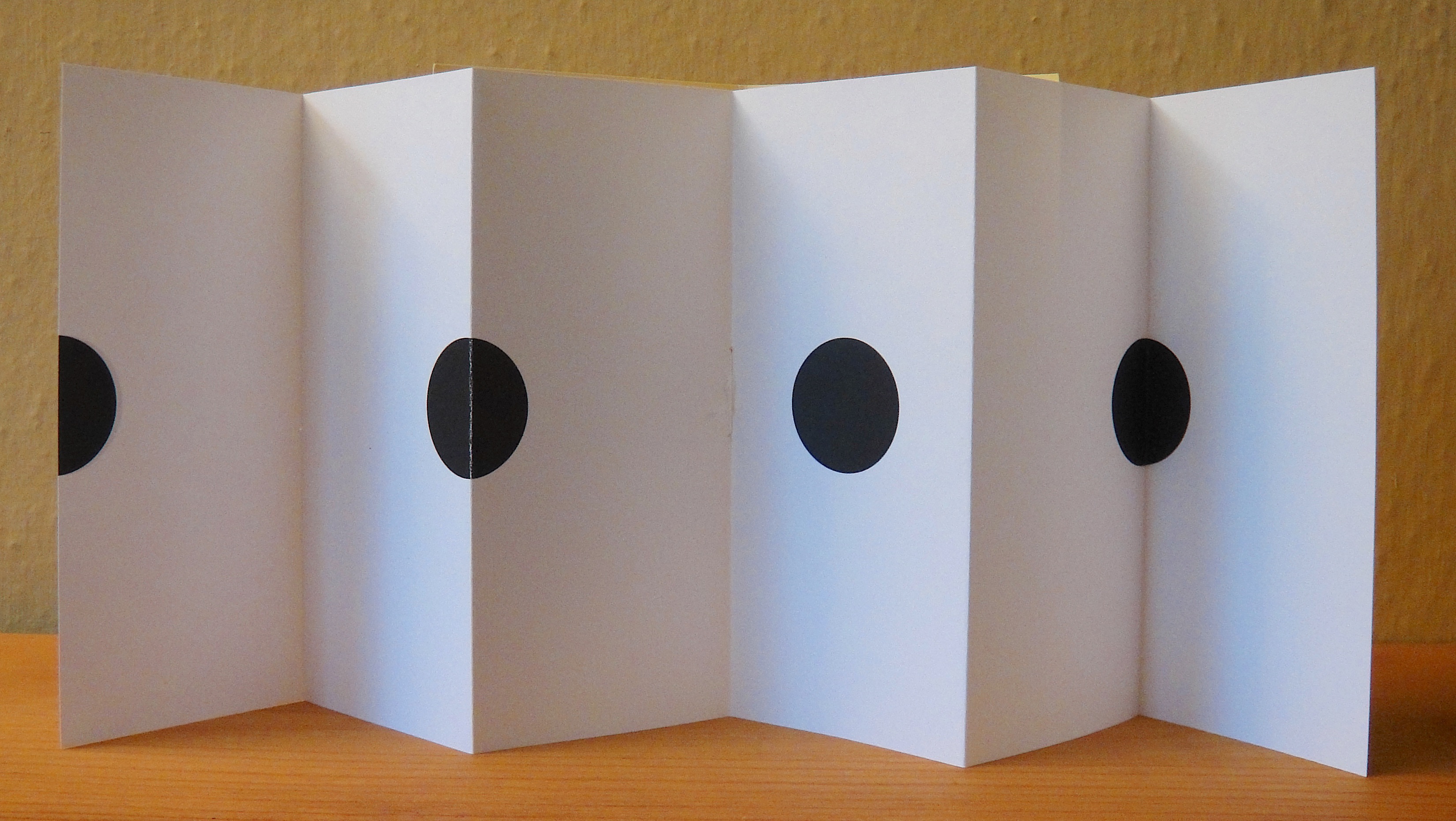



to be continued, 2012, unlimited edition
6 double-sided pages, individually 5.75" x 2.5" and when fully open 1ft 3"

Villers writes about his work that "...it plays on the deformation of the patterns printed on the folds of the paper. Here the leporello unfolds in six shutters. In the center of each of the five front and back folds is printed perpendicularly a black segment whose flatness is disturbed by the two flaps to form angles."


Remorqueur (Tugboat), 2012, unlimited edition
5 double-sided pages, each 5.75" x 3", fully open 1ft 3"

At the top of each page of this leporello are printed in capitals the ten letters of the name of his publishing imprint "remorqueur", with the word "remor" (remorse) on one side and "queur" (queer) on the other, additionally when seen from a slight angle the folds running down the middle of the circles create hearts.


Sunday, May 15, 2022

Patricia Bucher, Schlachtenpanorama (Battle Panorama), Schoeck, Belgium, 2011

front cover

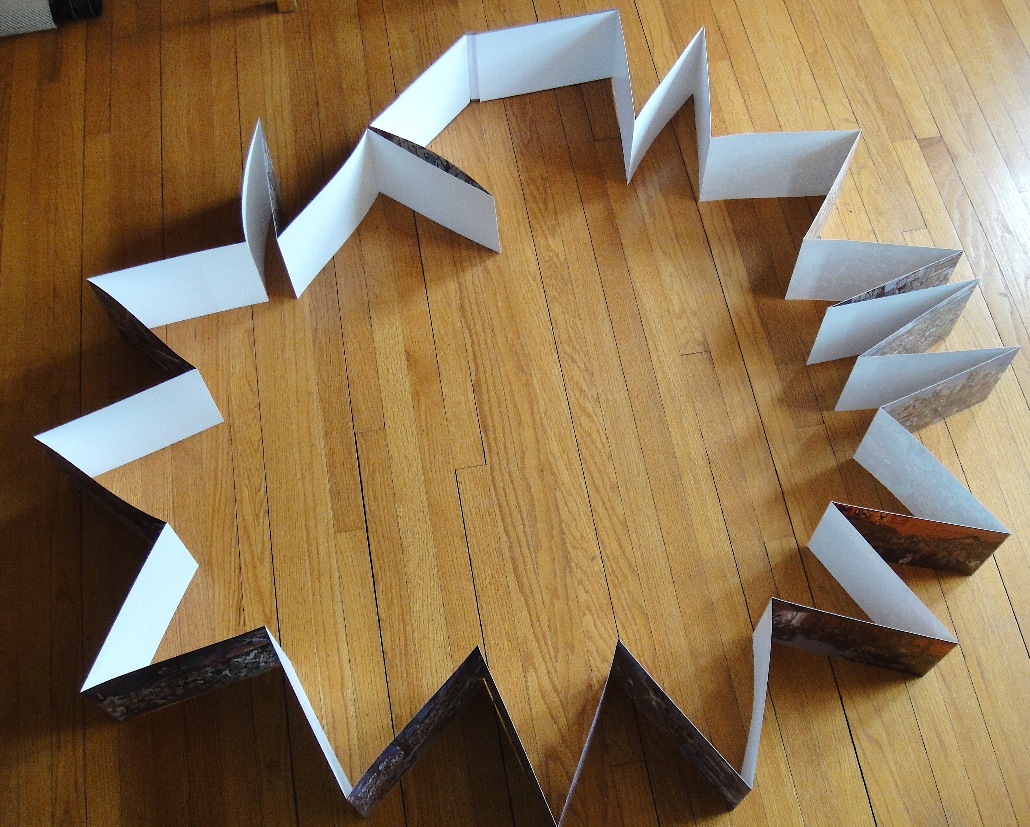
This rather odd circular accordion that does not open up in the traditional manner (indeed, its questionable if it really fits the definition of an accordion) is the documentation for a 33 feet long and 24" high 360 degree panorama that Bucher installed for her 2011 exhibition at the Kuntsmuseum, Lucerne.

Bucher's free hanging panorama was installed in a round room in the museum and consisted of over 2000 images of war from different periods, and various countries, that Bucher scanned and then re-assembled into this huge panoramic digital collage. I'm assuming you stood in the middle of this work and then scanned the panorama by turning around (see photo of artist with work below). Bucher received the Manor Art Prize Central Switzerland, and an exhibition at the museum was part of the prize, and this was the work she created for this occasion.

As you can see in the 2 images of the book opened up, it's presented in such a way that you cannot open up the accordion so that you can see the whole work. All you can do is open it up on some large table and then walk around it. Which is all kind of odd since with the real thing you stood in the middle and scanned the panorama from that vantage point. With the book as it is you are locked out from coming close to experiencing the work as it was in situ

Another thing, I'm not sure if my copy has a printing defect but in many areas of the pages there's a sort of white mottled effect throughout the book, and once you notice it, it really takes away from one's experience of the book!

32 single-sided pages, individually 8" x 12", circumference 32 feet.


the book 'opened up'


back cover
Bucher standing in front of her installation at the Museum of Art, Lucerne
Photo: Maria Schmid


Friday, May 13, 2022

Warja Lavater, Little Red Riding Hood (1965/1971), Snow White (1974), and OURASIMA (1991)

Warja Lavater (1913-2007) was born in Winterthur, Switzerland and studied graphic design from 1931 to 1935 at the prestigious Zurich Kunstgewerbeschule (School of Applied Art). One of her teachers was Ernst Keller, who was well regarded for pioneering the International Typographic Style and would later become known as the "father of Swiss graphics." Reflecting on her experience with Keller, Lavater would later recall: 

"What we were learning was design, and so we began with the most important thing, drawing. Where do you put a sign in a rectangle? What is the standard solution to this exercise? Should the strongest element be the sign or the drawing? How can both be distinguished at a distance, yet integrated in a composition?"

Lavater married another graphic designer, Gottfied Honegger, and from 1937 to 1958 they ran a graphic design studio in Zurich concentrating on designing symbols, logos and trademarks. Lavater also worked as an illustrator for the young person's magazine Jeunesse from 1944-1958. In 1958, the couple moved to New York for three years and she found work designing scientific illustrations for Dell Publishing. 

It was in New York, and stimulated by this new advertising and commercial environment, that she began to experiment with using pictograms to represent well-known children's stories. According to one writer it was after visits to New York's Chinatown that she saw the books used by Chinese calligraphers and she became "...enthralled with the mobility and versatility of this unique format that stretched like an accordion." 

Lavater would adopt this format for all her artists' books for the rest of her career, and in the process she created books that appealed to viewers unbound by the constraints of any particular language. Lavater described her books as imageries, and her use of this particular kind of visual language as a way to:

 "...express certain attitudes and actions, not by illustrating, but by writing picture-poems or 'pictograms.' We react to visual signs more effectively than to anything else, and I felt able to write by using such signals as codes, as signs that communicate... each story has its own 'code', signs that are easy to understand and that do not require a particular verbal language." 

In 1962, the Museum of Modern Art published her book William Tell in an accordion format that allowed the story to unfold chronologically, using only symbols to tell the narrative. The book sold out as soon as it became available. From that time onwards she published over 40 different accordion books, using this pictographic style and with each book accompanied with an index to the different symbols she used in each story. Many of her books were published in different languages, and clearly her pictographic style allowed a diverse audience of all ages to appreciate and enjoy her purely visual books. 

Lavater described herself as a Bildstellerin, or "picture writer" and the following quote by Carol Ribi from 100 Years of Swiss Design locates her work at a fascinating intersection between a variety of representational systems: "Warja Lavater's symbol notations and artists' books are situated on the boundaries of graphic design, painting, literature, and object art, and there mark a transition of genres that has yet to be thoroughly explored in picture or art theory."

Apparently, Lavater often compared her artists' books with other artforms, with a special attention to film, and considering that there is a similarity between the frame by frame of accordion books and that of film, it comes as no surprise to discover that at the age of 82 she turned some of her pictograms into a series of six short digital animation films set to music by the French composer Pierre Charvet. 

At the time of her death Lavater was living in Zurich and her estate is held by the Zurich Central Library.

______________________________________________________

Little Red Riding Hood, The Museum of Modern Art, 
New York, 1965/1971

Accordion with slip cover


see index of book's symbols on the right page

two images of the accordion opened


back cover

Dimensions: 42 single-sided pages, individual pages 6" x 4", 
and when fully open 14 feet.

______________________________________________________

Snow White, The Museum of Modern Art, New York, 1974

accordion with plexi slip cover


two images of the accordion opened


back cover

Dimensions: 41 single-sided pages, individual pages 6" x 4.25", 
and when fully open 14ft 6.25"

________________________________________________

OURASIMA [Tale of a Japanese fisherman], Adrien Maeght, Paris, 1991

Accordion with plexi slip cover


reverse side


back cover

Dimensions: 39 double-sided pages, individual pages 6.25" x 4.25", 
and when fully open 13ft 9.25"