everything about accordion publications, with a special interest in artists' accordions. stephen perkins [perkins100@gmail.com]
Sunday, December 28, 2014
Friday, December 19, 2014
Tais Koshino, Umbeagle, Brasil, 2013
 |
| reverse side |
Pakito Bolino and Nixel Junk, Pixel Junk Destructoid, Le Dernier Cri: Marseille, France, 20120 [200 copies]
 |
| Back and Front cover |
 |
| At the books' spine the two accordions meet up in their folded positions. |

Saturday, October 25, 2014
Thursday, October 23, 2014
Friday, June 27, 2014
Edgar Arceneaux, 107th Street Watts, Frankfurt: Revolver Archiv fur Aktuelle Kunst, 2003, ed. 1000
 |
| The two books that make up the publication, one is the photographic panorama and the other features assorted texts related to the work and the location. |
The accompanying accordion with texts by various authors
Jennifer Bartlett, Recitative, Baldwin Gallery: Aspen Colorado, 2010
 |
| A well produced catalogue/artists' book for a 2010 exhibition at the Baldwin Gallery of Barlett's Recitative that utilised her baked enamel steel plates in a mural that stretched 158 feet around the gallery. The piece, a meditation on color and a back-to-basics research into picture-making, is presented here in bookform in a wonderful simulation of the original. Accompanied by a short essay from Kiki Jai Rai in which she places this piece in the context of a 1976 work, Rhaspody, and observes similar themes being worked out in the present volume. The book has 40 pages, at 6" x 8.5" (H), and fully extended it's 20 feet. |
Scott McCarney, Far Horizons, Rochester: Visual Studies Workshop Press, 1998, ed. 500
 |
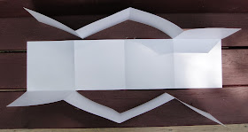
| In a statement inside the cover flap MaCarney explains that "...Far Horizons is the name of a traditional American quilt square, which this books adopts for its basic pattern." Stitching together panoramic landscapes from various places around the country, McCarney pays homage to these sites that provide him with moments of contemplation as well as a sense of awe at these huge American landscapes. This accordion includes two different directional turns which when laid out flat creates a solid sheet, precisely what one calls this publication that utilizes essentially two reading directions in one publication — I'm not sure that at the moment! 12 pages, 7" x 7" (H), extended 3' 8." |
 |
| Reverse side showing folds. |
David Horvitz, The Distance of a Day, Berlin: Motto Books and Chert, 2013
 |
An accordion postcard booklet made to accompany a work of Horvitz's that was in Art Basel, 2013. On the reverse is an interview with Horvitz by David Senior. This publication and the piece is premised upon the artist's discovery that "in early February, the California sunset coincides with the Maldives sunrise...." Horvitz engaged his mother in this work that was based upon him wanting "...us both to watch the sun going either under or over the horizon." Horvitz moved to Maldives to realize the piece and his mother lives by the beach in California. 18 pages 6.5" x 4.25" (h), extended 3' 2.25"
Horvitz is an interesting Brooklyn-based conceptual artist and right now he's seeking participants for his latest project:
For $1 USD I will think about you for one minute. I will email you the time I start thinking, and the time I stop.
To participate: Untitled Document |
Thursday, June 26, 2014
Marcos Guardiola, Cada Pulpo Con Su Pulpa, Madrid, nd

The title tranlates as "to each his own," and this is a beautifully illustrated double-sided and double-directional accordion. In an online description of himself Marcos states:
"I am architect, designer and illustrator. I studied in Madrid at the "ETSAMadrid", in Lisboa at the "Faculdade de Arquitectura de Lisboa" and in Mexico City at the 'Facultad de Arquitectura de la UNAM'.
I currently live and work in Madrid (Spain).
I like to use colors, textures and despite working with digital media, my work is acquiring an increasing handmade look.
I began illustrating in the newspaper El País where I discovered my predilection for images that speak, even without words. Then, I tried to bring that language to the young audience and I realized that, although we try, there are not many differences. Children are great critics. It was then that my picture book "panda" got a special mention in the "IV Premio Internacional de Compostela", promoted by Kalandraka.
My work has been published in various media, such as the design magazine Visual, Números Rojos magazine, Diagonal magazine, Courrier International or Creame Books".


